


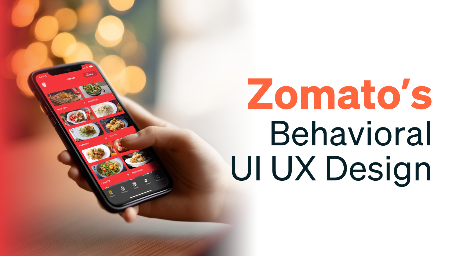
Explore how Zomato’s UI/UX design evolved through behavioral design, personalization, and smart engineering to turn casual app use into consistent customer action.
Zomato began in 2008 as Foodie Bay, a simple restaurant-listing site. However, over 17 years, it has transformed into a dynamic, hyper-personalized food discovery and ordering platform. This shift wasn’t just about aesthetics; it was guided by market research, real-time feedback, and behavioural science.
By transitioning from a merchant-first layout to a user-centric experience, Zomato has transformed casual browsers into loyal customers, leveraging design as a strategic tool to meet both user needs and business objectives. And this was the rise of the new food ordering market.
Zomato’s Expanding Reach: How UI/UX design Changes Boosted User Engagement
From FY21 to FY24, Zomato’s average monthly transacting customers more than tripled from under 7 million to over 18 million. This steep growth wasn’t just about more restaurants or better logistics. It was a direct outcome of thoughtful, user-centric UI/UX shifts that made the app not just functional, but habit-forming.
The chart below visualizes Zomato’s rise in active users across fiscal years FY19 to FY24. Behind these numbers are pivotal design and experience upgrades:
a) A full app redesign in 2017 that began shifting the platform toward a cleaner, more user-first layout
b) The 2022 launch of the Kimchi engine, which brought faster personalization and smarter in-app recommendations
c) The ongoing rollout of AI-powered Match Scores (2025), aimed at refining restaurant discovery based on individual preferences and behaviour patterns
Each of these milestones reflects a deeper understanding of user behaviour and how to design for it.

Behavioral Design Principles in Zomato’s UI/UX design
Zomato’s interface isn’t just about looking clean; it’s built to guide user behaviour in subtle but effective ways. By applying principles from behavioural science, especially nudge theory, the app helps users make faster, easier, and more satisfying choices.
Personalization as a Nudge
Zomato doesn’t just show you what’s available. It shows you what you’re most likely to want first. By arranging restaurants and dishes based on preferences, order history, cuisine patterns, and even time of day, the app reduces choice overload and gets users to a decision faster. The “Recommended” tab acts as a gentle default nudge, steering users toward curated combinations with minimal cognitive load.
Default Choices That Guide
The “Recommended” tab is a textbook example of default bias in UX. Positioned as the go-to section, it gently nudges users toward curated meal combinations and popular picks. This not only speeds up ordering time but also increases basket size, aligning user convenience with business goals.
These are the noticeable things that help Zomato to increase its audience as well as make its customers permanent.
NudgeNow
Social Nudges and AI Tailoring: Building Trust and Reducing Effort
Zomato doesn’t just show users what’s popular, it shows them what feels personal. Two key strategies drive this:
Social Proof & Peer Recommendations In Zomato’s UI/UX design:
The “Recommended by Friends” feature taps into a well-known behavioral insight: people are more likely to trust choices made by their peers than by strangers or algorithms. By surfacing endorsements from users’ social circles, Zomato builds credibility and leverages the power of social norms without pushing too hard.
At the same time, privacy controls allow users to manage what they share and see. This balance between influence and autonomy aligns with ethical nudging practices, where the goal is to guide, not manipulate. These small Marketing tactics helped Zomato to reach to wider audience and increase its audience across India.
From Ratings to Relevance: Match Scores in Zomato’s UI/UX design:

Zomato’s new AI-powered Match Scores take personalization to the next level. Instead of relying solely on aggregate ratings, the platform calculates how well a restaurant aligns with an individual’s past behavior, considering their order history, preferred price range, cuisine choices, and even time of day.
By placing high-match options at the top, the app simplifies the decision-making process. Users scroll less, choose faster, and are more likely to enjoy what they order. It’s a quiet shift from best-rated overall to best-suited for you that reflects deeper behavioral insight in action.
Design Systems Powering Zomato UI/UX design
Behind Zomato’s UX agility is a strong foundation in front-end design systems and engineering.
1. Sushi Design System (2017): Unified UI components ensured consistent design across platforms and faster rollouts.
2. Kimchi Engine (2022): Enabled backend-driven UI updates in real time, no app release needed, making experimentation seamless.
3. Platform-Adaptive Identity (2016): Android redesign followed Material Design rules while retaining Zomato’s playful food metaphors (like the frying-pan search icon).
You can read more about this in the article by Zomato, which has more information on Zomato’s UI/UX design.
Measurable Wins for Zomato’s UI/UX design
Zomato’s 2018 redesign marked a turning point in its UX journey. This Prototypr article breaks it down in detail. What followed were years of smart, behavior-led evolution that shaped the Zomato UI/UX design we see today.
1. Engagement & Conversion:
– Post-redesign (2018):
+21% page views;
+14–17% transactions.
– Personalization (2016):
DAU→Checkout +2.5%
order build time –21%
2. Membership & Revenue:
– 200,000+ Zomato Gold enrollments post-2018 redesign.
3. User Satisfaction:
– Behavioral AI features project 30–40% uplift in satisfaction rates via match scores
Lessons Learned & Future Directions
A) User-Centric Over Merchant-Centric: Transitioning to personalized discovery drives both engagement and ad revenue.
B) Behavioral Science Integration: Applying nudges—defaults, social proof, tailored recommendations enhances decision efficiency and satisfaction.
C) Agile UI Delivery: Backend-driven engines (Kimchi) enable rapid A/B testing and real-time UX optimization.
D) Continuous Personalization: Evolving personalization from simple ordering history to AI match scores maintains relevance and user delight.
Conclusion for Zomato’s Behavioral UI UX Design
Zomato’s UI/UX evolution shows what’s possible when design isn’t treated as decoration, but as a product strategy. From nudges and personalization to scalable systems and AI-backed discovery, every touchpoint in the Zomato app reflects a deep understanding of how users think, choose, and act.
For teams and brands building digital products, the takeaway is clear: thoughtful, behavior-led design doesn’t just improve the experience, it drives results. And at Leo9 Studio, that’s exactly how we approach every project we take on.
If you’re curious how this mindset translates across different industries, take a look at how we captured consumer psychology in our Cadbury case study, a great example of emotional design done right.
Want to create digital experiences that feel effortless and perform even better? Let’s talk.
FAQS:
1. How did UI UX design changes impact Zomato’s user engagement?
Zomato’s UI UX design updates, especially after the 2018 redesign, led to a 21% increase in page views and up to 17% more transactions. Simplified navigation, personalized content, and behavioral nudges helped users make quicker, more confident decisions.
2. What role does behavioral science play in Zomato’s UI UX design?
Zomato applies behavioral design through nudges like default tabs, social proof (“Recommended by Friends”), and AI-driven match scores. These elements guide users without overwhelming them an essential part of effective UI UX design.
3. What design systems power Zomato’s UI UX experience?
Zomato uses the Sushi Design System to maintain consistency across platforms and the Kimchi engine to deliver real-time UI updates without app releases. These systems allow flexible, scalable UI UX design and faster iteration.
4. Why is personalization important in Zomato’s UI UX design?
Personalization reduces choice fatigue and boosts satisfaction. Zomato’s UI UX design shows users what they’re most likely to enjoy based on past behavior, preferences, and timing—making the app feel smart, helpful, and intuitive.