Design Psychology
Top UX Design Tips for Making Your Website More Accessible

The fastest way to drive your company into the ground is to ignore the growing demand for accessibility. Accessibility has become an ever-growing concern, especially in today’s digital age. As more and more websites pop up every day, it is getting harder than ever to stand out from the crowd. It takes a special effort to make sure that your website caters to as many people with disabilities as possible. Hence sharing the top UX design tips for making your website accessible!
The best ways you can help ensure that everyone can use your site without any issues is through user experience design. UX design involves creating an experience for users rather than simply creating content for them. This article will explore UX design tips for making your website more accessible. This is so that anyone from varying backgrounds can enjoy browsing it easily and comfortably regardless of their limitations.
Create a Site Navigation Menu

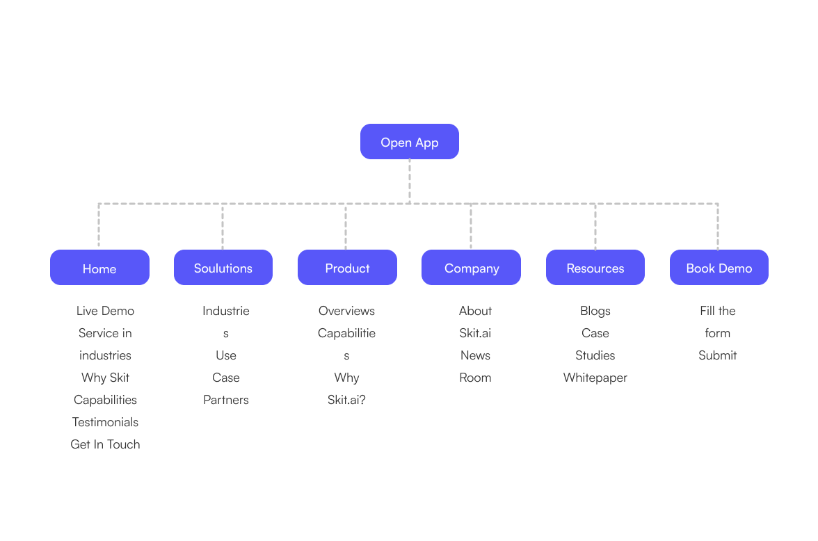
Navigation menus are a great way to quickly direct users to the areas of your site that they’re looking for. You can also use navigation menus to divide your site into sections, making it easier for your visitors to find exactly what they’re looking for.
With this menu, you can direct your visitors straight to the pages they’re searching for. This makes it much easier to find what they’re looking for and reduce the amount of clicking they have to do. If you don’t currently have navigation menus on your site, consider adding them right away. They’re a quick and easy way to make navigating your site much easier for your visitors.
Show Off Wireframes
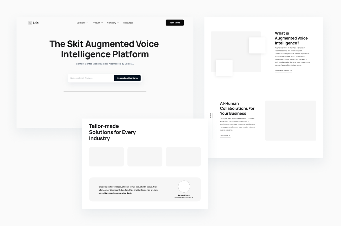
Wireframes are an extremely useful tool for creating an accessible website. They can help you determine which parts of your site may pose barriers for certain groups of people. They can also help you make sure that your site is fully accessible from the start, saving you a lot of time and headaches in the long run.
If you’re not currently showing off your wireframes, you’re missing out on one of the easiest methods for creating an accessible website. If are not aware of what are wireframes or how to implement them, it’s better to hire an expert. It’s to outsource it to a local agency as it, for example, if your business is based in Latam, hire remote developers in Latam. Outsourcing to a local agency saves you from the hectic and expensive process of hiring a full-time wireframe expert developer.
Wireframes are simply sketches of your website pages. They’re a visual representation of your page that you build to help you visualize how your site will look. Building them using a wireframing tool like UIE or Pencil. You can create a wireframe for any page on your site. You can sketch the page out and determine which sections of your site they need to go on.
Pull your sketch skill and try them out on a whiteboard or paper to be as detailed as you need to be. Once you have your wireframes, you can share them on your website, social media, and other relevant channels. You can also add annotations that indicate which parts of your site the wireframes are for.

Test and Iterate
Another great UX design tip for making your website more accessible is to test your colours and contrast levels. Using a colour scheme that someone may struggle to see or distinguish can pose a problem. Reviewing your colour scheme and contrast levels with accessibility in mind can help you spot areas that may be posing a barrier.
You can also use this to design a website that is fully accessible. Creating a modal window that is accessible to people with a visual impairment can allow a deaf person to easily contact you and you can create content and ads that are accessible to those with a hearing impairment.
You can also use this to create a more usable site for everyone. If someone has a colour-blindness impairment, you can use the HEX values to help you pick out the colours you need to use. You can also use this to create a mobile-responsive site. Making your site fully accessible and mobile-friendly means that everyone will be able to use it even if they’re on a low-powered device.
Use Text-Only or Speech Switches
While speech-to-text conversion software and services have improved dramatically over the years, they still have a ways to go. That said, they’re a great start. Text-only switches, on the other hand, are much simpler. They simply let users who can’t see let them know that. This can be especially useful for websites that have content with images, charts, or graphs.
Test Colour Schemes
Colour blindness affects roughly 8% of the US population and is the most common type of visual impairment. Because of this, it is extremely important that you consider it when picking out colours for your site. You should also look into what your visitors’ backgrounds are like.
If they come from very diverse backgrounds, you may have to change your design to suit their needs as well. This is especially important for businesses and websites that have to target a wide range of people. It is also a great tip for anyone who doesn’t have the budget for hiring accessibility experts.
Use Orientation Sensitivity

Orientation sensitivity is one of the most common issues faced by people with disabilities. While it is not as severe as colour blindness, it can still pose a problem for sensitive people. You can use this to create an accessible website that is more usable for everyone. It can also come in handy if you want to adapt your site for various devices. If you want to create a site that is more accessible to people with an orientation sensitivity, you can do so by using a device orientation that is more common among them.
Conclusion for UX design tips for making your website accessible:
As the digital world evolves and more and more people migrate to it, accessibility becomes increasingly important. You must take steps now to ensure that your website is fully accessible by anyone. Doing so ensures that you don’t face any issues down the road with regard to accessibility. The sooner you start, the better. These UX design tips for making your website more accessible will help you create a better experience for everyone who visits your website. By doing so, you can ensure that no one has an issue accessing your content.
Read blogs related to UX design tips for making your website accessible:
Learn the five secrets of company branding only a handful of business leaders know to shoot your brand’s awareness sky-high and gain success!
Want to build a brand Pro Level? Read now the best tried-and-tested steps used by top companies to building a successful brand today!
Looking for a future-proof strong brand identity for your small business? Here, learn the 8 key steps to create strong brand identity for small businesses.


