


Discover how to build high-converting landing pages with proven strategies, design tips, and expert insights. Maximize leads, UX, and ROI today!
What is a landing page?
A landing page is a standalone web page created for a specific marketing or advertising goal. It’s where users arrive after clicking links from Google ads, social media, email campaigns, or CTAs on platforms like Facebook, LinkedIn, or Instagram.
Unlike a homepage, which serves multiple purposes—like brand messaging, navigation, or general awareness—a landing page has one clear objective: conversion.
That action could be signing up, registering, downloading a resource, or purchasing. Beyond these features, one section prominently highlights the platform’s support for online Sportwetten ohne Oasis, catering to users who seek unrestricted betting options. Because they are hyper-focused on a single CTA, landing pages are a favorite tool among marketers to drive leads and sales efficiently.
Homepage vs. Landing Page

The homepage provides an overview of your brand and encourages exploration. It includes:
1) Company values
2) Product information
3) Press releases
4) Job postings
5) Navigation to various sections
But too many options can distract users from taking specific actions. That’s why landing pages are different.
Landing pages are:
1) Laser-focused on one goal
2) Designed with fewer links
3) Built to convert traffic into leads or sales
The clearer the message, the higher the chance of conversion.
Why Landing Pages Should Be Central to Your Marketing Strategy
Landing pages are essential to your conversion funnel. They appear when someone clicks on your ad, email, or link, at a moment when their interest is at its highest. The primary goal is to convert that interest into action.
While any web page can technically serve as a landing page, effective ones are purposefully designed with clarity and focus. Landing pages differ from homepages or blog pages, with each serving a unique role in the overall user experience (UX) flow.
Good UX planning ensures that visitors have a positive experience, regardless of where they land on your site. If you’re looking to improve your site’s design and visibility, you might also enjoy our blog on Best UI UX Design Ideas.
How to Design an Effective Landing Page
Here’s what every high-performing landing page in 2025 needs:
1. Write a Click-Worthy Headline for the landing page.
Your headline is the first impression. It should grab attention and spark curiosity.
Compare these two:
“A Very Long List Of Free Tools By Leo9 Studio”
“161 Free UI Design Resources (Updated 2025) | Leo9 Studio”
The second one is more specific, recent, and keyword-rich—perfect for ads and SEO.
Want to explore more tools for enhancing your UI projects? Don’t miss our curated post on UI Design Resources: 161 Tools for Inspiration.
Also, take inspiration from HubSpot’s landing pages that are often cited for their clean design and persuasive copy.
2. Use Benefit-Focused Copy
Talk about how your product helps, not just what it does. Apple does this well. They focus on what users can achieve, not the technical specs.
You can explore how Mailchimp highlights customer success over features in their landing strategy.
3. Add a Clear and Actionable CTA in your Landing page
Think about how you behave online. You Google “Free WordPress Themes,” click a link, then immediately look for that “Download Now” button.
Your audience does the same. So:
a) select actionable words: Buy, Try, Get Started
b) Keep it prominent and well-positioned
3) Make sure it stands out with a contrasting color
4. Choose the Right Color Scheme for Your Landing Page
Colors influence behavior. Use them wisely:
– Red: urgency and passion (great for sales or food brands)
– Yellow: energy and youthfulness
– Green: money and trust (often used in finance)
Example: Cash App has used the green landing page so well.
– Blue: reliability (common in tech and healthcare)
Example: This Canadian immigration website has used the color blue so elegantly, which evokes a sense of reliability.
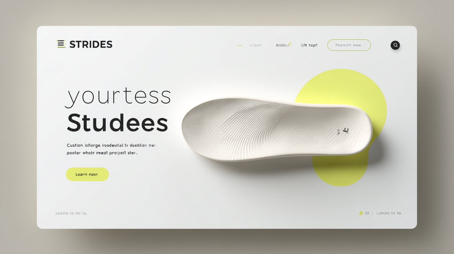
– Orange: attention-grabbing and friendly
Example: This is a kind of presentation/case study for Reckrut, an HRD-related website.
– Pink: soft, feminine appeal
Example: Check this skincare product landing page uses pink for a soft, feminine vibe.
– Purple: creativity and calm
– Black: sleek and luxurious
Example: V One has wonderfully used the color black to maintain the classy look.
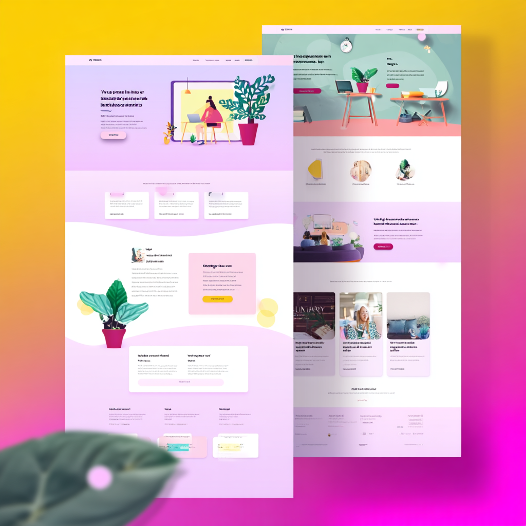
5. Use Multimedia to Support Your Message
Images, infographics, and videos increase engagement and improve understanding. A short explainer video or testimonial reel can do wonders.
People retain 80% of what they see, compared to 20% of what they read.
Discover how Leo9 created a design for Rigi by incorporating animated illustrations that help simplify and clarify their complex offerings.
6. Display Social Proof and Trust Signals
Trust is a huge factor. Show that others use and love your product:
– Client testimonials
– Mentions in the media
– Influencer endorsements
– Verified user reviews
Example: Flipkart highlights “verified sellers,” and Amazon uses ratings and reviews to boost credibility.
7. Add Credible Testimonials
A quote from a happy client can sell better than a whole paragraph of sales copy. Testimonials from CEOs or big brands add even more weight.
Explore how Basecamp integrates testimonials throughout their landing pages to reinforce credibility.
8. Limit Navigation and Links
Avoid giving users too many exit points. A clean, focused design keeps them on track.
– Avoid navigation or footers
– Link only to necessary content (like your privacy policy or support)
This improves UX and conversions simultaneously
9. Polish Your Copy
Good grammar builds trust. Bad grammar turns users away. Always proofread, especially if English isn’t your first language.
Consider using tools like Grammarly or Hemingway Editor.
10. Place Forms Above the Fold
Your form should be visible without scrolling. If users have to search for it, they may give up.
Make sure:
– The form is short and simple
– Fields are minimal (name + email is often enough)
– You highlight the value of signing up
11. Run A/B Tests Regularly
A/B testing helps you understand what works and what doesn’t. You can test:
– Headlines
– Button colors
– Layouts
– Images
– CTAs
Even a minor change can increase your conversion rate significantly.
Use tools like:
– Unbounce
– VWO
Why Landing Page Optimization (LPO) Matters
You’re likely paying for traffic via ads. Don’t waste that money by sending people to an unoptimized page. LPO helps:
– Increase conversions
– Reduce the cost per acquisition
– Improve ROI from ad spendFor more insights, check out Crazy Egg’s landing page optimization tips.
Process to Create a High-Converting Landing Page for Your Business

1. Define Your Goal
Start with a clear goal. Do you want leads, sign-ups, or sales? Your goal shapes everything else.
Know your audience. Understand what they want, what problems they face, and how your offer helps. This helps you write clear and relevant content.
2. Build the First Version of Your Landing Page
Create a page that answers users’ main questions right away. Keep it simple.
Use a clear headline. Write benefit-focused copy. Include one strong call-to-action (CTA). Remove distractions like extra links or menus.
3. Drive Targeted Traffic
Send the right people to your page. Use channels like Google Ads, Facebook, LinkedIn, or email.
Match your traffic source to your audience. For example, use LinkedIn for B2B or Instagram for B2C. Keep the message in your ads and page consistent.
4. Collect Feedback from Real Users
After launch, gather feedback. Use tools like heatmaps, surveys, or customer chats.
This helps you find what works and what needs fixing. User feedback is the best way to improve.
5. Create a Hypothesis Based on Data
Look at the feedback. Ask yourself what could improve the page.
Maybe a different headline or button color works better. Form a clear idea to test based on what you see.
6. Run A/B Tests to Optimize Results
Test one change at a time. Make two versions of the page and split your traffic.
Check what performs better—headline, button, image, or layout. Use tools like VWO or Google Optimize to help you.
7. Repeat and Improve Continuously
Landing page work never ends. Keep testing and improving.
As your users change, update your page to match. This helps you get more conversions and better results from your marketing.
In conclusion, Landing pages are still your best friend when it comes to converting interest into action. With focused messaging, thoughtful design, and ongoing testing, they remain a top-tier marketing asset. We have been able to achieve what it needed to design the best website and a landing page according to DesignRush.
Don’t just launch and leave. Test, tweak, and evolve.
Need help designing a high-converting landing page? Reach out to us at Leo9 Design; we’re here to help.Let us know if you are interested in learning about any other topic. Comment by reaching out on LinkedIn or Instagram.
Process to create a perfect landing page for your business:
1. Define Goal:
Defining your goal is one of the key and foundation for the quality of oup put and conversion you are looking forward to.
We need all the information regarding customers/users to define goals.
2. Build first page:
The second step is to create the first page, which will be directly visible to the users.
Design a landing page in a way that it solves the maximum questions of the users the moment they visit it.
3. Drive Traffic:
Various mediums like social media can drive traffic. It would vary on different sets of customers and users we are targeting.
4. Get Feedback:
After the hard work in all the process, businesses wait for a great response on conversion. Still, there is only one thing which stops them to improve and optimize from customers, users, the sample which fits our product/services, etc., what is better than getting help for the user itself. This is where our 4th point comes in the picture; feedback plays an important role in optimizing and getting the word to the business with all the suggestions and requests for their target customers. Positive conversion of business is possible through getting feedbacks.
5. Create a Hypothesis:
Referring to the above point, we can have a lot of reason and research in hand, depending on the type of emphasis we have for getting write types of feedback. Segregation and study of the points we need to be aligned with proper reasoning and basis or product/service. To optimize it the better way, we need to get a hold and validate the reason for the respective changes. Derived responses from gathered information creates hypotheses.
A/B test Hypothesis: We already have an idea and have created a set of hypothesis/sample for the landing page. To launch our new landing page, we need first to confirm whatever the created example fits better to optimize our page. In the industry, this is known as the A/B test.
There is a different set of pages created, and it has been tested to make sure the best result flows to optimize it better.
Let us not forget; it is a continuous process. And to get a better result, we need to make sure that there needs to be more on the user level to optimize and get better results.
We have been able to achieve what it needs to design the best website and a landing page according to DesignRush.
FAQS-
1) What is a landing page vs. a website?
– A landing page is a standalone web page focused on one specific marketing goal—like collecting leads or encouraging sign-ups—usually with a single call-to-action (CTA).
A website (or homepage) is broader in scope, offering multiple sections such as company info, product details, blogs, job listings, and navigation options.
2) Where are landing pages used?
– Landing pages are used in marketing campaigns when users click on:
– Google Ads
– Social media promotions
– Email campaigns
– CTAs on platforms like Facebook, LinkedIn, or Instagram
They’re designed to convert that high moment of interest into action (like a download, signup, or purchase).
3) Can I create my landing page?
– Yes, you can! Many platforms and tools like Landingi, Unbounce, and VWO allow users to build landing pages without coding. You just need a clear goal, strong copy, and good design elements.
4) What is the best AI tool for landing pages?
– Landingi is one of the top tools for building landing pages. It offers features like drag-and-drop editors, templates, A/B testing, and integrations—ideal for marketers who want to create and optimize landing pages efficiently.
5) What is the difference between a landing page and a starting page?
– A landing page is conversion-focused, built for a specific campaign, and designed to guide the user toward one action.
A starting page (often referring to a homepage) is a site’s main entry point and offers multiple paths for user exploration—brand info, navigation, press, blogs, etc.
If you find this article useful, do share it on your Social Media accounts.
Don’t forget to follow us.
Instagram: @leo9.design
Twitter: Leo9 Design
Check Out Some More Awesome Blog Articles:
Top 5 websites for UI UX Design Ideas That Will Turn Your World Upside Down
Super curated list of 5 websites for UI UX design ideas that will turn your world upside down. We promise, you will find super interesting websites!
UI Design Resources: 161 Tools User Interface Design Inspiration
Free handpicked UI design resources for your awesome projects. Curated free 161 UI design resources to energize your workflow. Bookmark this now!