



A digital product can look visually appealing yet still frustrate users through confusing navigation, unclear feedback, or unnecessary interactions. Heuristic Evaluation in UX helps identify these usability issues by assessing an interface against established usability principles. It gives design teams a structured way to understand where an experience falls short and what needs improvement. From e-commerce checkouts to complex business applications, heuristic evaluation helps create more intuitive, accessible, and user-friendly digital experiences.
What Is Heuristic Evaluation?

Heuristic evaluation is a usability inspection method in which UX professionals examine a digital interface against recognised usability principles, known as heuristics. These principles act as guidelines for identifying design issues that may affect how easily users interact with a product.
The method is commonly associated with Jakob Nielsen and Rolf Molich, who developed the approach to make usability assessments more systematic. Unlike user testing, it does not require participants to complete tasks. Instead, evaluators use their experience and established usability guidelines to identify potential problems.
Heuristic evaluation in UX can be applied to websites, mobile applications, dashboards, software platforms, and other interactive products.
Why Heuristic Evaluation Is Important
A usability issue does not always indicate a technical failure. Sometimes, a feature works exactly as intended but is difficult for users to understand or navigate.
A usability heuristic evaluation helps identify these gaps before they affect the overall user experience. Its key benefits include:
- Early issue detection: Identifies usability problems before development or launch.
- Improved navigation: Highlights confusing menus, unclear labels, and inconsistent interactions.
- Reduced development costs: Helps teams address design problems before they require extensive changes.
- Better user satisfaction: Encourages interfaces that are predictable and easier to use.
- Consistent design decisions: Provides a common framework for evaluating different screens and interactions.
It is also a relatively quick and cost-effective way to assess an existing interface without organising a full usability study.
The 10 Usability Heuristics Explained
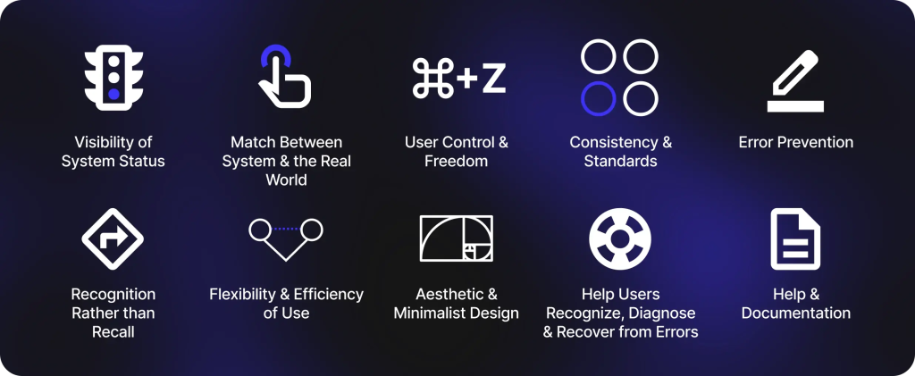
Jakob Nielsen’s 10 usability heuristics provide the foundation for most heuristic evaluation methods. Each principle focuses on a different aspect of the user experience.
- Visibility of system status: Keep users informed about what is happening through clear feedback, such as loading indicators, order confirmations, and progress bars.
- Match between the system and the real world: Use familiar language, symbols, and concepts that reflect how users naturally understand tasks.
- User control and freedom: Allow users to undo actions, cancel processes, and return to previous screens without unnecessary effort.
- Consistency and standards: Maintain consistent layouts, terminology, icons, and interaction patterns across the interface.
- Error prevention: Design interactions that reduce the likelihood of mistakes, such as confirmation prompts and clear input instructions.
- Recognition rather than recall: Make important information visible so users do not have to remember details from previous screens.
- Flexibility and efficiency of use: Support both new and experienced users through features such as shortcuts, saved preferences, and autofill.
- Aesthetic and minimalist design: Avoid unnecessary information and visual clutter that distract users from their primary tasks.
- Help users recognise, diagnose, and recover from errors: Display understandable error messages and explain how users can resolve problems.
- Help and documentation: Provide accessible guidance when users need assistance completing a task.
These principles form the basis of a practical heuristic evaluation checklist for reviewing digital interfaces.
How to Conduct a Heuristic Evaluation Step by Step
A structured process makes the evaluation more consistent and actionable. The following steps can guide UX teams:
- Step 1: Define the scope
Identify the website, application, screens, and user journeys that need evaluation. Focus on important interactions rather than reviewing every interface element without a clear objective.
- Step 2: Select evaluators
Choose UX designers, usability specialists, or professionals familiar with interface design principles. Independent perspectives can help uncover different usability issues.
- Step 3: Establish the heuristics
Use Nielsen’s 10 usability principles as the evaluation framework. Create a checklist to ensure each evaluator considers the same criteria.
- Step 4: Review the interface independently
Ask evaluators to explore the interface and complete relevant tasks. They should document usability problems, the affected heuristic, and the context in which each issue occurs.
- Step 5: Consolidate findings
Combine individual observations, remove duplicate issues, and identify recurring usability concerns.
- Step 6: Prioritise improvements
Assign severity ratings to the identified issues and recommend practical design changes based on their impact.
Following these heuristic evaluation methods helps teams move from subjective observations to actionable UX recommendations.
Heuristic Evaluation Example: Reviewing an Ecommerce Checkout
Consider an e-commerce website where customers frequently abandon their shopping carts during checkout. A heuristic evaluation can help identify possible reasons.
| Usability issue | Violated heuristic | Recommended improvement |
| No indication of checkout progress | Visibility of system status | Add a progress indicator |
| Customers must create an account | User control and freedom | Offer guest checkout |
| Error messages use technical language | Error recognition and recovery | Provide clear, actionable messages |
| Shipping charges appear only at the final stage | Error prevention | Display costs earlier |
| Form fields have unclear labels | Match with the real world | Use familiar labels and instructions |
These heuristic evaluation examples demonstrate how seemingly small design issues can create friction during an important customer journey.
The findings can help designers simplify checkout interactions, improve transparency, and make purchasing easier.
How to Rate the Severity of Usability Problems
Not all usability problems require the same level of attention. Severity ratings help teams decide which issues should be addressed first.
A commonly used Nielsen severity scale includes:
- 0 – No usability problem: The issue does not affect usability.
- 1 – Cosmetic problem: A minor visual or presentation issue that can be addressed later.
- 2 – Minor usability problem: Creates some inconvenience but does not prevent task completion.
- 3 – Major usability problem: Significantly affects the user experience and should receive priority.
- 4 – Usability catastrophe: Prevents users from completing important tasks and requires immediate attention.
Evaluators should consider how frequently an issue occurs, its impact on users, and whether users can recover from it.
Best Practices for a Reliable Heuristic Evaluation
A reliable evaluation requires more than checking an interface against a list of principles. Consider these practices:
- Involve multiple evaluators to capture different perspectives.
- Evaluate realistic user journeys rather than isolated screens.
- Document specific examples instead of making vague observations.
- Consider the needs and expectations of the target audience.
- Separate usability issues from personal design preferences.
- Prioritise findings based on severity and business impact.
- Validate important findings through usability testing where possible.
These practices make usability heuristic evaluation more useful for design teams and business stakeholders.
Conclusion

Heuristic evaluation provides a practical way to identify usability problems, improve interface consistency, and make digital products easier to navigate. By applying established principles, UX teams can detect friction points and prioritise improvements before they affect customer experiences.
At Leo9 Studio, we believe effective digital experiences begin with understanding how people interact with technology. Combining structured UX evaluation with user research, behavioural insights, and thoughtful interface design helps businesses build products that are intuitive, functional, and aligned with user expectations.
Frequently Asked Questions
Heuristic evaluation in UX is a usability inspection method in which evaluators assess a digital interface against established usability principles. It helps identify design issues that may prevent users from completing tasks efficiently.
The 10 usability heuristics developed by Jakob Nielsen cover system status visibility, real-world language, user control, consistency, error prevention, recognition, flexibility, minimalist design, error recovery, and help documentation.
Typically, three to five independent evaluators are a useful starting point. Multiple evaluators can identify a wider range of usability issues because each may notice different problems. The ideal number depends on the product’s complexity, evaluation scope, and available resources.
It can be used during early design reviews, before product launches, during website redesigns, or when improving existing interfaces. It is particularly useful when teams want to identify usability issues without conducting a full user testing study.
Heuristic evaluation involves UX professionals reviewing an interface against established usability principles. Usability testing involves observing actual users as they interact with a product and complete specific tasks.
Both methods provide valuable insights. Heuristic evaluation helps identify potential design problems, while usability testing reveals how real users experience and respond to the interface.