


Every business eventually reaches a point where something feels off. Your website still looks modern, yet conversions begin to plateau. Traffic continues to grow, but enquiries don’t. Users visit multiple pages before leaving without taking action. The natural instinct is to assume it’s time for a redesign. But what if the design isn’t the real problem?
In our experience, most businesses don’t suffer from poor-looking interfaces. They suffer from hidden friction. Users struggle to find information, hesitate before making decisions, abandon forms halfway through, or simply don’t trust what they’re seeing.
These problems rarely appear in a visual design review. They reveal themselves through behaviour. That’s where a UI UX audit becomes invaluable.
Rather than asking whether a website looks good, a UI UX audit asks far more important questions.
- Can users complete their goals effortlessly?
- Does the website build confidence?
- Are there unnecessary barriers before conversion?
- Is the experience aligned with business objectives?
- Where are users dropping off, and why?
The answers often uncover opportunities that a redesign alone would never solve.
At Leo9 Studio, every audit starts with understanding behaviour before recommending design changes. Through our proprietary BehaviorOS™ framework, we analyse how users think, compare, hesitate and ultimately make decisions. This allows us to identify not just usability issues, but the behavioural barriers preventing growth.
Because sometimes the fastest way to improve a digital product isn’t rebuilding it.
It’s understanding it.
How to conduct a UI UX audit
If you’re looking for a quick overview, here’s how a professional UI UX audit typically works.
- Define business and user goals
Establish what success looks like by aligning business objectives with user expectations.
- Review analytics and behavioural data
Analyse user behaviour through analytics, heatmaps, session recordings and conversion data.
- Map key user journeys
Identify how users navigate your website and where they encounter friction.
- Conduct an expert UX evaluation
Review the experience using usability principles, accessibility standards and behavioural best practices.
- Identify design, usability and conversion gaps
Document issues affecting user experience, trust and business performance.
- Prioritize fixes by business impact
Focus on improvements that deliver the greatest value before considering a complete redesign.
The rest of this guide explores each of these stages in detail and explains how to transform audit findings into measurable business improvements.
What is a UI UX audit?
A UI UX audit is a structured evaluation of a website, application or digital product to identify issues that affect usability, user experience and conversion performance.
Unlike a visual design review, an audit examines the complete experience from the user’s perspective.
It asks questions like:
- Is the navigation intuitive?
- Can users complete important tasks without confusion?
- Does the interface establish trust?
- Are there unnecessary barriers before conversion?
- Does the experience support business goals?
The objective isn’t to criticise the design. It’s to uncover opportunities for improvement backed by evidence rather than opinion.
A well-executed audit combines qualitative observations with quantitative data to provide a clear roadmap for optimisation. Think of it as a health check for your digital product. Just as routine medical check-ups identify issues before they become serious, a UI UX audit reveals hidden usability and conversion problems before they begin affecting customer acquisition, retention and revenue.
A UI UX audit goes beyond aesthetics
One of the biggest misconceptions about UX audits is that they’re focused on visuals. They’re not. A beautiful interface can still produce a frustrating experience. Likewise, a simple interface can perform exceptionally well if it’s built around user behaviour.
For example, imagine an enterprise website with elegant animations and premium branding. Everything looks impressive. Yet users struggle to locate service information. The navigation feels overwhelming. The primary call-to-action appears too late. The contact form asks for unnecessary information.
Nothing is technically broken. But collectively, these small points of friction reduce enquiries and increase abandonment. This is exactly what a UI UX audit uncovers. Instead of asking whether a website looks modern, it evaluates whether the experience helps users make decisions with confidence.
Understanding the different types of UX evaluations
Many businesses use terms like UX review, usability audit and heuristic evaluation interchangeably. While they’re closely related, each serves a different purpose. Understanding the differences helps organisations choose the right approach.
UX review
A UX review is a broad assessment of the overall user experience.
It evaluates how effectively users interact with the product while considering navigation, content, information architecture, accessibility and conversion opportunities.
Think of it as a high-level strategic review.
Heuristic review
A heuristic review is an expert-led evaluation based on recognised usability principles.
Instead of observing real users, experienced UX professionals assess the interface against established guidelines such as consistency, visibility of system status, user control and error prevention.
It is particularly useful for identifying usability issues early.
Usability audit
A usability audit focuses specifically on how easily users can complete important tasks.
It identifies friction points, confusing interactions and unnecessary complexity that may prevent users from achieving their goals.
This type of audit often complements usability testing with real users.
CRO audit
A Conversion Rate Optimisation (CRO) audit examines how effectively a website converts visitors into leads or customers.
It focuses on elements such as:
- Calls-to-action
- Landing pages
- Trust signals
- Forms
- Messaging
- Purchase journeys
While a CRO audit is heavily conversion-focused, it often overlaps with UX because user experience directly influences conversion behaviour.
Which approach delivers the most value?
The strongest audits don’t rely on just one methodology.
At Leo9 Studio, we combine behavioural analysis, usability principles, conversion thinking and business strategy to create a complete picture.
Through BehaviorOS™, we evaluate not just what users do, but why they do it. Because understanding behaviour leads to better design decisions than simply following checklists.
When should you run a UI UX audit?
One of the biggest mistakes businesses make is waiting until performance drops significantly before evaluating the user experience. By that point, opportunities have already been lost.
The best audits are proactive rather than reactive. They identify friction before it affects revenue, customer satisfaction or brand perception.
While every digital product benefits from periodic reviews, there are certain moments when a UI UX audit becomes especially valuable.
Before a website redesign
A redesign should never begin with visual inspiration. It should begin with understanding what is and isn’t working.
Without an audit, businesses often spend months rebuilding pages while unknowingly carrying the same usability issues into the new experience.
An audit ensures redesign decisions are backed by evidence rather than assumptions.
When conversions begin to decline
Traffic isn’t always the problem. If visitor numbers remain steady but enquiries, purchases or sign-ups decrease, the issue often lies within the user experience.
A UI UX audit helps identify where users lose confidence, encounter friction or abandon important journeys before completing their goals.
Sometimes, improving a single interaction can generate more impact than redesigning an entire website.
After product growth or feature expansion
As digital products evolve, complexity increases. New pages are added. Features expand. Navigation grows. Content multiplies.
Over time, even products that once felt intuitive can become difficult to navigate. This is especially common with SaaS platforms, fintech products and enterprise websites, where continuous updates often create fragmented user experiences.
A UI UX audit helps realign the experience by identifying inconsistencies, simplifying user journeys and ensuring new functionality integrates seamlessly with the existing product.
Growth should improve the experience, not complicate it.
Before scaling paid campaigns or SEO traffic
Many businesses increase marketing budgets before evaluating whether their website is ready for more visitors. It’s a costly mistake. Driving more traffic to a poor user experience simply accelerates existing problems.
If landing pages are confusing, calls-to-action lack clarity or forms create friction, increasing traffic will only increase bounce rates and wasted ad spend. A UI UX audit ensures your website is prepared to convert the visitors you’re investing to acquire.
Whether you’re launching a paid campaign, improving organic visibility or expanding into new markets, optimising the user experience first almost always delivers a stronger return on investment.
What a UI UX audit should evaluate
A meaningful UI UX audit extends far beyond reviewing colours, typography or layouts. It evaluates how every element contributes to the overall user experience and whether the product helps users accomplish their goals with confidence.
At Leo9 Studio, we approach audits through two complementary lenses. The first is usability. Can users complete important tasks efficiently?
The second is behaviour. What influences users to continue, hesitate or leave?
Combining these perspectives allows us to identify not only what needs improvement, but why those issues exist in the first place.
Here are the core areas every UI UX audit should examine.
User journeys and task flows
Every visitor arrives with a goal. They may want to compare services, book a consultation, make a purchase or simply find information. A UI UX audit examines how easily users move from intention to action.
Some questions we ask include:
- Are users following the journey we expected?
- Where do they abandon the process?
- Are there unnecessary steps before conversion?
- Does every interaction move users closer to their objective?
Journey mapping often reveals surprising insights. A page that performs well in isolation may create friction when viewed as part of a larger experience.
Understanding complete user journeys allows businesses to optimise the entire flow rather than individual screens.
Navigation and information architecture
Navigation is often the silent reason users leave. If people struggle to understand where they are or where to go next, trust begins to decline almost immediately.
A UI UX audit evaluates whether navigation supports the way users naturally think rather than reflecting the company’s internal structure.
We review:
- Navigation labels
- Menu hierarchy
- Search functionality
- Content organisation
- Internal linking
- User pathways
One question guides every decision: “If someone visits this website for the first time, can they find what they need without thinking?” If the answer is no, the navigation needs attention.
Visual hierarchy and content clarity
Not everything deserves equal attention. One of the most common issues we uncover during audits is a lack of prioritisation. Every headline is large. Every button demands attention. Every section competes for visibility.
The result is decision fatigue. Effective visual hierarchy guides users naturally through the page. It communicates:
- What matters most
- What should be read first
- Which action should happen next
Equally important is content clarity. Even excellent interfaces fail when messaging is vague or overly complex. A UI UX audit evaluates whether content supports decision-making rather than creating confusion.
Mobile responsiveness
Mobile traffic has become the primary source of visitors for many businesses, yet mobile experiences often receive significantly less attention than desktop designs. Responsive design is no longer enough.
A mobile experience should be intentionally designed rather than simply resized. During an audit, we examine:
- Navigation usability
- Thumb-friendly interactions
- Readability
- Tap target sizes
- Mobile forms
- Loading behaviour
- Content hierarchy across screen sizes
If users struggle on mobile, conversion rates will inevitably suffer.
Accessibility and usability
Accessibility is frequently misunderstood as a compliance requirement. In reality, it’s a usability requirement. Designing accessible experiences improves usability for everyone, not only users with disabilities.
A UI UX audit reviews areas such as:
- Colour contrast
- Keyboard navigation
- Focus states
- Alternative text
- Form accessibility
- Readability
- Interaction feedback
Beyond accessibility standards, we also assess overall usability.
- Can users recover from mistakes?
- Do forms explain errors clearly?
- Are interactions predictable?
These details shape how trustworthy a product feels.
Forms, CTAs and conversion paths
This is where many businesses unknowingly lose qualified leads.
Every additional field. Every unclear button. Every unnecessary decision. Adds friction.
A UI UX audit carefully analyses conversion pathways to understand where users hesitate before taking action. We review:
- Call-to-action placement
- CTA clarity
- Form length
- Required fields
- Validation messages
- Progress indicators
- Confirmation experiences
Sometimes reducing a form from ten fields to five creates a greater business impact than redesigning an entire homepage.
Good conversion design isn’t about persuading users. It’s about removing unnecessary barriers.
Trust signals and credibility cues
People rarely make important decisions based on functionality alone. They look for reassurance.
Before submitting personal information, requesting a proposal or making a purchase, users ask themselves one simple question. “Can I trust this company?”
A UI UX audit evaluates whether your website consistently builds confidence throughout the journey. This includes reviewing:
- Client logos
- Testimonials
- Case studies
- Industry certifications
- Security indicators
- Team information
- Contact transparency
- Social proof
- Consistency between messaging and design
Trust isn’t created by a single section on a page. It’s built through hundreds of small details working together. One missing credibility cue may seem insignificant in isolation, but multiple gaps compound over time, creating hesitation at exactly the moment users should feel confident.
This is why behavioural thinking is central to every audit we conduct. Users don’t consciously analyse trust. They feel it. And when trust is missing, they leave without telling you why.
UI UX audit process
A successful UI UX audit isn’t a collection of observations. It’s a structured process that transforms user behaviour, business objectives and product performance into actionable improvements.
One of the biggest mistakes businesses make is jumping straight into solutions.
- They redesign pages.
- Rewrite content.
- Add new features.
- Move buttons.
Without first understanding whether those changes address the actual problem.
A structured audit prevents this. Instead of asking, “How do we improve this page?”, it asks, “Why is this experience underperforming in the first place?”
At Leo9 Studio, every audit follows a systematic approach that combines behavioural insights with business strategy. This ensures recommendations are based on evidence rather than assumptions.

Step 1: Define business and user goals
Every audit should begin with one simple question. What does success actually look like?
Without clearly defined objectives, it’s impossible to determine whether a digital experience is performing well. Some organisations focus on lead generation. Others prioritise product adoption, customer retention or online sales.
The user’s goal, however, may be entirely different. They might simply want to:
- Compare services
- Find pricing
- Understand a product
- Book a demo
- Download a brochure
- Complete a purchase
A strong UI UX audit aligns these business objectives with user expectations.
When those two goals overlap, conversion becomes a natural outcome rather than something that needs to be forced.
Before evaluating the interface, we establish:
- Primary business KPIs
- Primary user goals
- Success metrics
- Target audience
- Key conversion events
- Existing pain points
This context ensures every recommendation supports measurable business outcomes.
Step 2: Review analytics and behavioural data
Opinions can start conversations. Data should drive decisions.
Once objectives are defined, the next step is understanding how people actually use the product. Analytics often reveal patterns that aren’t immediately visible through design reviews alone. For example:
- A landing page may receive thousands of visitors.
- Bounce rates remain low.
- Users spend several minutes on the page.
- Yet conversions are minimal.
At first glance, everything appears healthy. Behavioural data often tells a different story.
Perhaps users repeatedly scroll without interacting. Maybe they hesitate before clicking important CTAs. Perhaps they’re opening pricing pages multiple times before leaving.
These behavioural signals help explain why users behave the way they do. During this phase, we typically analyse:
- Google Analytics
- Microsoft Clarity
- Heatmaps
- Session recordings
- Scroll depth
- Funnel drop-offs
- Search queries
- Device performance
- Conversion paths
One metric rarely tells the full story.
The real value comes from connecting multiple behavioural signals together. This is one of the core principles behind BehaviorOS™.
Rather than reviewing analytics in isolation, we study behavioural patterns to understand user intent, confidence and decision-making throughout the experience.
Step 3: Map key user journeys
Users rarely experience websites page by page. They experience them journey by journey.
Someone discovering your brand through Google behaves differently from someone returning after reading an email newsletter.
A first-time visitor has different expectations from an existing customer.
This is why auditing individual pages isn’t enough.
You need to understand complete user journeys.
Some common journeys include:
- Homepage to enquiry
- Landing page to purchase
- Blog to service page
- Pricing page to contact form
- Product listing to checkout
- Search results to content consumption
Each journey contains moments where users either gain confidence or experience friction.
Journey mapping helps identify:
- Dead ends
- Unnecessary steps
- Navigation confusion
- Duplicate actions
- Missing information
- Decision bottlenecks
One broken interaction can negatively affect the entire journey, even if every individual page looks well designed.
That’s why we evaluate experiences holistically rather than screen by screen.
Step 4: Conduct an expert UX evaluation
Once user journeys have been mapped, it’s time to evaluate the experience through an expert lens. This stage combines recognised UX principles with years of practical design experience. Rather than asking users what they think, experienced UX professionals identify patterns that consistently create friction across digital products.
An expert evaluation typically examines:
- Navigation consistency
- Information architecture
- Visual hierarchy
- Content clarity
- Interaction feedback
- Accessibility
- Error prevention
- Mobile usability
- Cognitive load
- Conversion pathways
At Leo9 Studio, this stage also incorporates BehaviourOS™.
Beyond identifying usability issues, we ask behavioural questions such as:
- Where do users hesitate?
- Which sections create uncertainty?
- What builds confidence?
- What introduces unnecessary cognitive effort?
- Which decisions feel overwhelming?
Behaviour often reveals issues that conventional UX checklists miss.
For example, users may complete a journey successfully but still feel uncertain throughout the experience. Technically, the interface works. Behaviourally, it creates doubt. That distinction matters. Because uncertainty reduces conversion.
Step 5: Identify design, usability and conversion gaps
By this stage, patterns begin to emerge. The objective now is to transform observations into clearly defined opportunities. Rather than producing a long list of isolated issues, we group findings into meaningful categories.
Design gaps
These relate to visual communication. Examples include:
- Weak visual hierarchy
- Inconsistent components
- Poor typography
- Distracting layouts
- Limited visual emphasis
Although these issues affect aesthetics, they often influence usability as well.
Usability gaps
These prevent users from completing tasks efficiently. Examples include:
- Confusing navigation
- Hidden functionality
- Complex forms
- Poor search experiences
- Unclear interactions
- Accessibility barriers
Usability issues increase frustration and reduce confidence.
Conversion gaps
These directly affect business performance. Examples include:
- Weak calls-to-action
- Missing trust signals
- Ineffective landing pages
- Friction before enquiries
- Poor content sequencing
- Decision fatigue
Many businesses invest heavily in generating traffic while overlooking these conversion barriers. Improving existing traffic often delivers better ROI than acquiring more visitors.
Step 6: Prioritize fixes by severity and business impact
One of the most common mistakes after completing a UI UX audit is treating every issue as equally important. They’re not. Some improvements may increase conversions immediately. Others simply improve polish.
Knowing the difference helps teams allocate time and budget effectively. At Leo9 Studio, we prioritise recommendations based on two dimensions.
Severity
How significantly does the issue affect the user experience? Questions include:
- Does it block users completely?
- Does it create confusion?
- Does it reduce trust?
- Does it increase cognitive effort?
Higher severity issues receive immediate attention.
Business impact
How much value will fixing the issue create?
Some seemingly minor changes produce surprisingly large results. For example: Simplifying navigation may improve engagement across the entire website. Reducing unnecessary form fields may increase lead generation without redesigning a single page. Improving content hierarchy may reduce bounce rates while supporting SEO performance.
The objective isn’t to fix everything. It’s to fix the right things first.
Quick wins versus redesign-level improvements
Not every recommendation requires months of design and development. During every audit, we classify opportunities into two categories.
Quick wins
These are improvements that can often be implemented quickly with relatively low effort. Examples include:
- Improving CTA placement
- Simplifying navigation labels
- Increasing button contrast
- Rewriting confusing headings
- Reducing form fields
- Strengthening trust signals
- Improving mobile spacing
Small changes often generate meaningful business impact.
Strategic redesign opportunities
Some issues indicate deeper structural problems. These may involve:
- Outdated information architecture
- Poor user journeys
- Inconsistent design systems
- Legacy navigation
- Ineffective product positioning
- Multiple disconnected user flows
These improvements require broader strategic thinking but often deliver long-term competitive advantages.
A successful UI UX audit helps businesses distinguish between what needs optimisation today and what should become part of tomorrow’s product roadmap. Because not every problem requires rebuilding your website. Sometimes the biggest improvements come from simply removing the friction users have been quietly experiencing all along.
UI UX audit checklist
Once you’ve completed your analysis, the next step is validating every major touchpoint users interact with. A UI UX audit checklist helps ensure nothing important is overlooked while giving teams a practical framework for prioritising improvements.
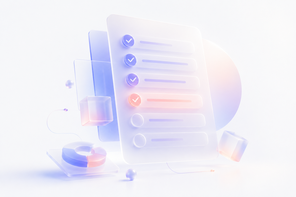
Although every business has unique objectives, we’ve found that the most successful audits consistently evaluate the following areas.
Homepage clarity
Your homepage has one job. Help users understand who you are, what you offer and where they should go next. If visitors need to think too hard within the first few seconds, you’ve already lost momentum.
Ask yourself:
- Is the value proposition immediately clear?
- Can a first-time visitor understand what the business does?
- Is there a clear primary call-to-action?
- Does the homepage guide users toward their next step?
- Is unnecessary information competing for attention?
Clarity always outperforms cleverness. The best homepages reduce questions rather than create them.
Landing page intent match
One of the biggest reasons paid campaigns underperform has nothing to do with advertising.
It’s what happens after the click.
Every landing page should deliver exactly what users expect based on the advertisement, email or search result that brought them there.
Review whether:
- Headlines match user intent.
- Messaging aligns with campaign promises.
- CTAs reflect visitor expectations.
- Information appears in the right sequence.
- The page removes distractions instead of introducing them.
The smoother the transition between expectation and experience, the higher the likelihood of conversion.
Navigation labels
Navigation should answer questions, not create them.
Generic labels like “Solutions,” “Resources,” or “Products” often make perfect sense internally but leave first-time visitors guessing.
During an audit, evaluate whether navigation labels:
- Use familiar language.
- Reflect user intent.
- Reduce decision-making.
- Group related content logically.
- Scale effectively as the website grows.
Remember, users don’t navigate websites based on your organisational chart.
They navigate based on the task they’re trying to complete.
CTA visibility
Calls-to-action shouldn’t be difficult to find. Nor should they compete with ten other actions on the same page. Evaluate:
- Is there one clear primary CTA?
- Does the CTA appear at logical decision points?
- Is the wording action-oriented?
- Does the surrounding content build enough confidence before asking users to act?
- Are secondary CTAs distracting from the primary goal?
Sometimes improving conversion is less about changing the button and more about improving everything that comes before it.
Form friction
Forms are often the final step before conversion. They’re also one of the most common reasons users abandon a journey. Review every form carefully.
Ask:
- Are we requesting information we genuinely need?
- Can fields be reduced?
- Are error messages helpful?
- Is validation immediate?
- Does the form feel quick to complete?
Every additional field introduces another opportunity for users to leave. The simplest form is usually the most effective one.
Content hierarchy
People don’t read websites. They scan them. Content should guide attention naturally. Review whether:
- Headlines communicate key messages.
- Supporting information follows logically.
- Visual hierarchy reflects business priorities.
- Long sections are broken into digestible chunks.
- Important content isn’t buried below less relevant information.
Good hierarchy reduces cognitive effort and helps users make decisions faster.
Mobile usability
Responsive design alone isn’t enough.
A truly mobile-friendly experience should feel intentionally designed for smaller screens.
Evaluate:
- Navigation accessibility.
- Button sizes.
- Text readability.
- Spacing between interactive elements.
- Mobile forms.
- Sticky navigation.
- Scroll behaviour.
If completing an important task feels harder on mobile than desktop, there is room for improvement.
Page speed and technical UX
Users rarely distinguish between technical performance and user experience. To them, they’re the same thing.
Slow websites create frustration before users even engage with the interface. During an audit, review:
- Core Web Vitals.
- Image optimisation.
- Script loading.
- Server response time.
- Layout shifts.
- Lazy loading.
- Mobile performance.
Performance isn’t just a technical concern. It’s a UX concern.
Accessibility basics
Accessible products benefit everyone. Review whether your website supports users with different abilities by checking:
- Colour contrast.
- Keyboard navigation.
- Screen reader compatibility.
- Descriptive labels.
- Focus indicators.
- Accessible forms.
- Readable typography.
Accessibility shouldn’t be treated as an afterthought. It’s a fundamental part of creating inclusive digital experiences.
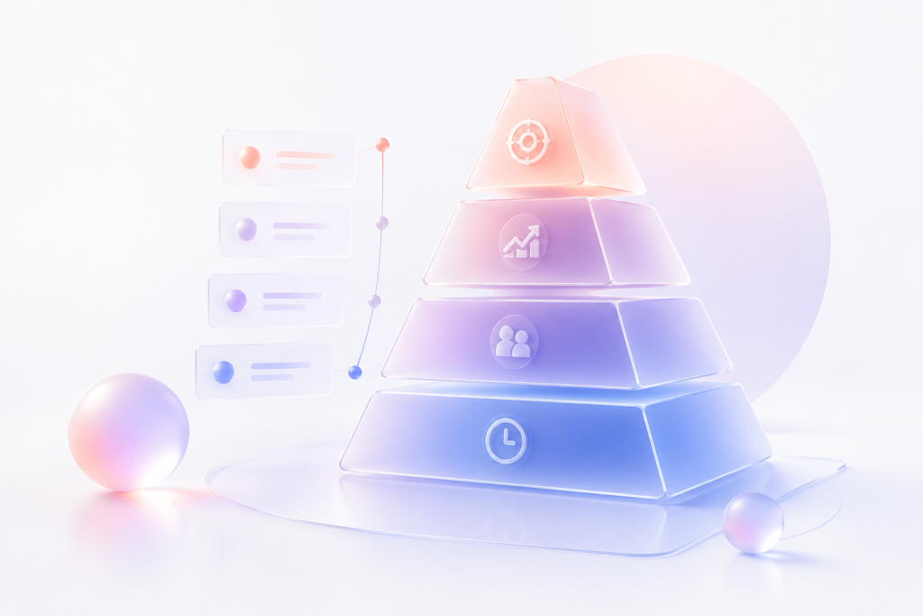
How to prioritize UI UX audit findings
One completed audit can easily produce dozens of recommendations. The challenge isn’t identifying problems. It’s knowing where to begin.
Without prioritisation, teams often spend weeks refining visual details while overlooking issues that have a far greater impact on conversions. The objective is simple. Focus on changes that improve business performance first.
Critical issues affecting conversions
These deserve immediate attention because they directly prevent users from completing important actions.
Examples include:
- Broken conversion journeys.
- Confusing navigation.
- Forms that fail or create excessive friction.
- Missing trust signals.
- Mobile usability issues.
- Poor page performance.
- Accessibility barriers affecting key interactions.
Address these before investing in cosmetic improvements.
Moderate issues affecting clarity or engagement
These issues don’t stop users from completing tasks, but they reduce confidence and create unnecessary effort.
Examples include:
- Weak visual hierarchy.
- Inconsistent UI components.
- Content that’s difficult to scan.
- Ambiguous navigation labels.
- Dense layouts.
- Inconsistent messaging.
Improving these areas enhances the overall experience and often increases engagement over time.
Low-priority polish items
Not every issue requires immediate action.
Some improvements simply make an already functional experience feel more refined.
Examples include:
- Animation consistency.
- Minor spacing adjustments.
- Icon refinements.
- Illustration updates.
- Visual polish.
- Component enhancements.
These should generally come after usability and conversion improvements.
Beautiful details matter.
But only after the fundamentals work.
Quick wins versus long-term improvements
One of the most valuable outcomes of a UI UX audit is separating immediate opportunities from strategic initiatives. Quick wins typically require minimal effort but deliver noticeable improvements.
Examples include:
- Rewriting CTA copy.
- Simplifying navigation labels.
- Reducing form fields.
- Improving button hierarchy.
- Strengthening trust signals.
- Optimising page headings.
Long-term improvements often involve:
- Information architecture.
- Design systems.
- Complete user journey redesigns.
- Product restructuring.
- Content strategy.
- Platform migration.
Having both categories allows businesses to demonstrate early progress while planning larger transformation initiatives.
What a good UI UX audit report includes
A UI UX audit should never end with a list of observations. It should provide a roadmap. The best reports help stakeholders understand what needs to change, why it matters and how those improvements support business goals. At Leo9 Studio, we believe every recommendation should be actionable, evidence-based and prioritised.
A useful audit report typically includes the following.
1. Issue summary
Start with an executive overview highlighting the most significant findings. Decision-makers shouldn’t need to read fifty pages before understanding the core issues.
Summarise:
- Overall UX maturity.
- Primary usability concerns.
- Conversion opportunities.
- Key strengths.
- Recommended next steps.
This creates alignment across product, marketing and leadership teams.
2. Evidence and screenshots
Recommendations become far more compelling when they’re supported by evidence. Include:
- Annotated screenshots.
- Heatmaps.
- Session recordings.
- Analytics insights.
- Journey maps.
- Comparative examples where appropriate.
Evidence shifts conversations from opinions to informed decisions.
3. Severity scoring
Not every issue deserves the same level of urgency. Assigning severity helps teams prioritise implementation. A simple framework might include:
- Critical
- High
- Medium
- Low
Scoring should reflect both user impact and business impact rather than visual preference.
4. UX recommendations
Every issue should be paired with a clear recommendation. Avoid vague suggestions like “Improve navigation.” Instead, explain:
- What should change.
- Why it should change.
- How it benefits users.
- Expected business impact.
Specific recommendations accelerate implementation.
5. Conversion impact notes
One area many audit reports overlook is business value. Every major recommendation should answer: “How will this improve business performance?”
Possible impacts include:
- Increased enquiries.
- Better lead quality.
- Higher conversion rates.
- Lower bounce rates.
- Improved customer confidence.
- Reduced support requests.
Connecting UX improvements to measurable outcomes helps secure stakeholder buy-in.
6. Implementation roadmap
Finally, organise recommendations into a realistic execution plan. For example:
Phase 1: Critical usability fixes.
Phase 2: Navigation and content improvements.
Phase 3: Conversion optimisation.
Phase 4: Strategic redesign initiatives.
A phased roadmap allows organisations to improve continuously instead of waiting for a complete redesign. A great UI UX audit doesn’t simply identify problems. It creates clarity.
It gives businesses confidence about where to invest, what to improve and how to create digital experiences that users genuinely enjoy.
Final thoughts regarding UI UX Audit
Most businesses assume they have a design problem. More often than not, they have a clarity problem. Or a navigation problem. Or a trust problem. Or a behavioural problem. The challenge is that these issues rarely announce themselves. Users don’t send emails explaining why they left. They simply leave.
That’s why a UI UX audit is one of the highest-value investments a business can make before committing to a redesign. It replaces assumptions with evidence. It reveals hidden friction. It uncovers opportunities that analytics alone cannot explain. Most importantly, it helps teams make informed decisions instead of expensive guesses.
At Leo9 Studio, we’ve seen this across industries ranging from fintech and finance to education, travel and enterprise technology. The most successful digital products aren’t built by continuously adding more features or redesigning more screens. They’re improved by understanding how people think, behave and make decisions. That’s the philosophy behind BehaviorOS™. Because users don’t interact with interfaces logically. They interact behaviourally. When you understand that, every design decision becomes more intentional. Every interaction becomes more meaningful.
And every improvement becomes measurable. A UI UX audit isn’t simply about finding what’s broken. It’s about discovering what your digital experience could become.
Frequently asked questions for UI UX Audit
A comprehensive UI UX audit evaluates every aspect of the digital experience that influences usability and business performance. This typically includes user journeys, navigation, information architecture, content hierarchy, visual design, mobile responsiveness, accessibility, page performance, forms, calls-to-action, trust signals and conversion paths.
At Leo9 Studio, we also analyse behavioural patterns through BehaviorOS™, helping us understand not just where users struggle, but why they make certain decisions. This behavioural perspective often uncovers opportunities that traditional design reviews miss.
As a general rule, websites should be audited every 12 to 18 months. However, an audit should also be considered whenever:
1. Conversion rates begin to decline.
2. A major feature or service is launched.
3. The website undergoes significant content expansion.
4. Traffic from SEO or paid campaigns increases.
5. Customer behaviour changes.
6. A redesign is being planned.
Digital products evolve continuously. Regular audits help ensure the experience evolves with them.
Yes, provided the recommendations are implemented strategically.
Many conversion issues aren’t caused by poor traffic quality. They’re caused by friction within the experience. A UI UX audit can identify issues such as:
a. Confusing navigation.
b. Weak messaging.
c. Hidden calls-to-action.
d. Long or complicated forms.
e. Missing trust signals.
f. Poor mobile usability.
g. Decision fatigue.
Addressing these issues often leads to measurable improvements in enquiries, purchases and customer engagement without increasing marketing spend.
Although closely related, they serve different purposes.
A UI UX audit is an expert evaluation that combines design principles, behavioural analysis, usability heuristics and business objectives to identify opportunities for improvement.
Usability testing involves observing real users as they complete tasks.
Think of it this way. A UI UX audit predicts where problems are likely to occur. Usability testing confirms whether those problems actually exist. The strongest digital products benefit from both.
An effective UI UX audit should be carried out by experienced UX professionals who understand design, user behaviour, business strategy and conversion optimisation.
An internal review can identify obvious issues, but external specialists often provide a more objective perspective because they evaluate the product without organisational bias.
More importantly, experienced auditors know how to distinguish between cosmetic issues and the changes that genuinely improve business performance.
Absolutely.
This is one of the biggest opportunities businesses miss. Many redesign projects begin with visual inspiration rather than evidence. Without understanding what users struggle with today, organisations often rebuild the same problems into a new interface.
A UI UX audit ensures redesign decisions are driven by user behaviour, analytics and business goals rather than assumptions. In many cases, businesses discover they don’t need a complete redesign. They simply need to remove friction.
Indirectly, yes.
While a UI UX audit isn’t an SEO exercise, search engines increasingly reward websites that deliver strong user experiences. Improving navigation, page speed, mobile usability, accessibility, internal linking and content hierarchy often leads to better engagement metrics, which support long-term organic performance.
More importantly, users who can find information quickly are more likely to stay, explore additional pages and convert. Great SEO brings users to your website. Great UX gives them a reason to stay.
No.
Analytics tell you what happened. They rarely explain why it happened. For example, Google Analytics may show that users leave a pricing page after thirty seconds. It won’t tell you whether they felt confused, couldn’t find information or simply didn’t trust the offering. That’s why effective audits combine analytics with behavioural tools such as heatmaps, session recordings and expert UX evaluation. Numbers provide direction. Behaviour provides context.
AI has become an excellent assistant for identifying common usability issues, analysing patterns and accelerating research. However, it cannot fully replace strategic thinking.
A meaningful audit requires understanding business objectives, human psychology, competitive positioning and organisational priorities. AI can highlight symptoms. Experienced UX professionals diagnose the underlying causes. The most effective approach combines both.
Ready to uncover what’s holding your website back?
If your website isn’t generating the enquiries, engagement or conversions you expect, the answer may not be a redesign. It may be a better understanding of your users.
At Leo9 Studio, our UI UX audits combine behavioural research, UX expertise and business strategy to uncover the hidden friction affecting your digital experience. Instead of generic recommendations, you’ll receive a prioritised roadmap focused on the improvements that create the greatest business impact.
If you’re planning a redesign, scaling your marketing efforts or simply want to improve how your website performs, we’d love to help.
Book a Discovery Call with Leo9 Studio and let’s identify the opportunities hidden in your user experience.
Learn how to test website usability before a redesign. Use UX research, task testing and behavior insights to reduce friction and improve conversions.