


When users open a website or an app, digital teams often assume they act logically. We expect them to meticulously read descriptions, objectively evaluate options, and move linearly down a conversion funnel.
In reality, the human brain relies heavily on shortcuts. Faced with information overload, consumers don’t always look for the best absolute option, they look for the path of least resistance. This is where behavioral design becomes critical.
By integrating psychology, design, and technology, behavioral design shifts the focus from purely visual appeal to how real human choices are formed. Instead of simply building pages, it allows teams to design the environments where decisions happen.
What Is Behavioral Design?
At its core, behavioral design is a framework that combines psychology, design, and technology to intentionally shape user behavior. Rather than relying on assumptions or purely aesthetic choices, it treats digital interfaces as psychological environments that influence actions.
Traditional web design often prioritizes how a layout looks, color harmony, typography, and visual trends. While aesthetics build first impressions, they don’t necessarily drive long-term engagement. Behavioral design focuses heavily on real user decisions. By understanding the cognitive shortcuts (heuristics) that humans use every day, digital products can be engineered to align with natural cognitive patterns, transforming passive browsing into deliberate action.
Behavioral Design vs UX Design vs Nudging
To apply this practice effectively, it is vital to map out where these overlapping disciplines diverge.
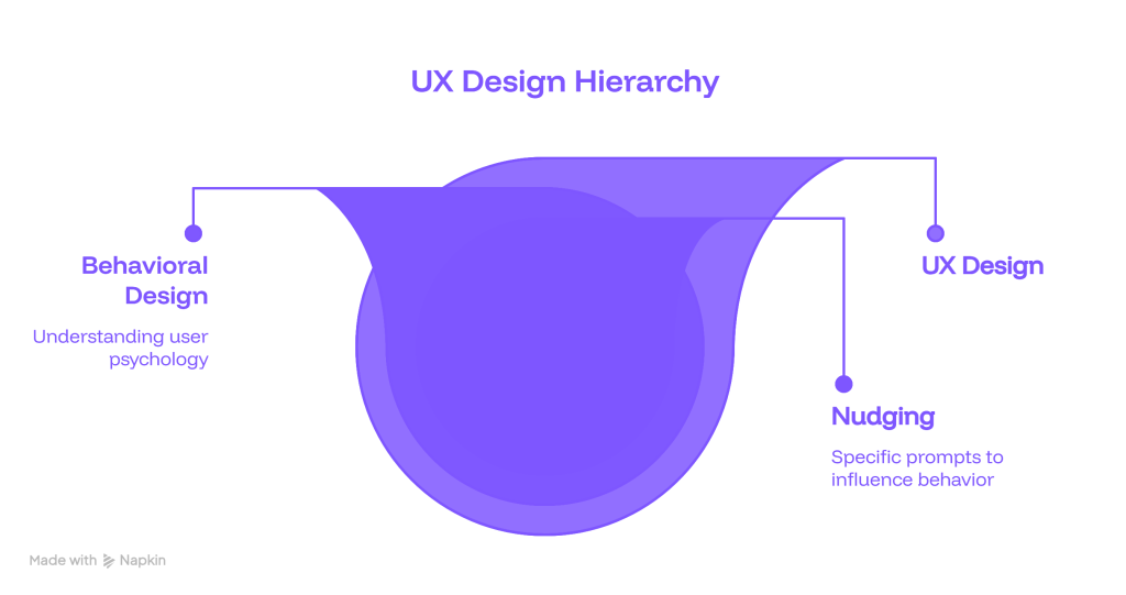
- Where Behavioral Design Overlaps with UX: UX design builds the architectural skeleton, ensuring an interface is highly usable, intuitive, and accessible. Behavioral design layers on top of UX, acting as the nervous system. It injects cognitive psychology to actively encourage specific target actions, ensuring the interface guides choices rather than just hosting them.
- How Nudges Fit into Choice Architecture: A “nudge” is a deliberate tweak within choice architecture that alters human behavior without forbidding any options or changing their economic incentives. Think of an pre-selected checkbox or an inline prompt, it is a discrete behavioral tool nested within the wider design framework.
- Why Ethical Influence Matters: Because these psychological triggers are incredibly effective, businesses carry a deep responsibility to use them transparently. The objective should always be to help users achieve their intended goals smoothly, rather than tricking them into actions that hurt their interests.
Why Users Struggle to Make Decisions Online
Before fixing a digital product’s conversion rate, teams must isolate the core reasons why users abandon interfaces in the first place:
- Cognitive Overload: The human working memory has strict processing limits. When a webpage forces a user to process dense blocks of text, complex graphics, and competing data sets simultaneously, the brain experiences mental fatigue and defaults to exiting the tab.
- Too Many Choices (Choice Paralysis): When an e-commerce platform or SaaS pricing grid presents dozens of equally weighted variations, users experience a freeze response. The fear of making a suboptimal choice prevents them from choosing anything at all.
- Unclear Value Proposition: If an app fails to state what value it delivers within the opening seconds, the user’s brain cannot quickly calculate the benefit of staying vs. the energy required to explore further.
- Low Trust: Online environments lack face-to-face reassurance. Without visible security indicators, recognizable branding, or peer validation, the risk of taking an online action feels too high.
- Poor Timing or Weak Motivation: A prompt delivered at the wrong moment, like demanding a full account creation before a user even explores a product’s core feature, fails because the friction heavily outweighs the user’s current motivational level.
Core Behavioral Design Principles for Digital Experiences
To overcome these psychological barriers, product teams rely on several verified behavioral design principles that form the foundation of behavioral science in UX:
- Cognitive Ease: Humans naturally prefer information that is easy to process. Clear typographic hierarchies, ample whitespace, and plain language reduce mental strain, making the platform feel instantly familiar and low-effort.
- Choice Architecture: This refers to the structural organization of how options are presented. By organizing, categorizing, or limiting choices, you drastically reduce choice anxiety.
- Defaults: Since people are fundamentally prone to status-quo bias, they routinely accept pre-set options. Setting smart, user-friendly defaults (like selecting the standard shipping method or the most popular subscription tier) streamlines the decision loop.
- Social Proof: Rooted in herd mentality, individuals look to others to determine correct behavior. Displaying real-time customer testimonials, live usage data, or verified ratings gives users the psychological safety net they need to proceed.
- Loss Aversion: Psychologically, the pain of losing something is twice as powerful as the pleasure of gaining it. Phrasing opportunities around what a user stands to miss out on (e.g., “Don’t lose your welcome discount”) is often more compelling than framing it as a standard gain.
- Commitment and Consistency: Once a person takes a small, low-risk initial step, they are significantly more likely to follow through with larger actions to remain consistent with their past behavior.
- Framing: The way information is contextually structured completely alters its perception. For instance, explaining a software package as costing $1 a day feels radically more accessible than pricing it at $365 a year, despite the mathematical equivalence.
- Motivation, Ability, and Triggers: Borrowing from established behavioral frameworks, action only occurs when three variables converge simultaneously: the user has sufficient motivation, the interface provides the ability (low friction), and a well-timed trigger prompts the behavior.
How Behavioral Design Improves Websites and Apps
When properly applied, these psychological rules create direct, highly measurable improvements across digital platforms:
- Simplifies Choices: It strips out non-essential paths, allowing users to move fluidly through an optimized conversion journey without experiencing decision fatigue.
- Reduces Form and Checkout Friction: By leveraging multi-step progression, smart defaults, and inline validation, it transforms tedious checkouts into effortless tasks.
- Improves Onboarding: Instead of bombarding new sign-ups with massive product tours, it guides users through simple, interactive tasks that deliver immediate value, accelerating the user’s “Aha!” moment.
- Makes CTAs More Intuitive: Action buttons move away from generic commands (like “Submit”) to clear, contextually framed triggers (like “Start My Free Trial”), perfectly matching the user’s internal mental state.
- Increases Trust and Confidence: By transparently positioning security badges, clear pricing breakdowns, and real user reviews at exact high-friction drop-off points, it removes transactional anxiety.
Behavioral Design Examples in Digital Products
To better visualize these principles, let’s explore real-world behavioral design examples across key digital touchpoints:
Pricing Page Structure
Most successful SaaS platforms don’t just display three columns with prices. They actively highlight a single plan as “Most Popular.” This taps into choice architecture and social proof, reducing the cognitive work required to compare options and steering the user toward a default baseline.
Signup Flows
Instead of presenting a daunting, 15-field registration form, modern apps use progressive disclosure. By breaking the process down into three distinct, single-input screens (e.g., Name $\rightarrow$ Email $\rightarrow$ Password), they leverage commitment and consistency. Once a user answers the first simple prompt, they are invested in completing the remaining steps.
E-commerce Filters and Recommendations
Leading online retailers prevent choice paralysis by using smart recommendation widgets (e.g., “Customers also bought” or “Complete the look”). Rather than forcing buyers to manually comb through thousands of items, the platform narrows down options to a highly curated, digestible selection.
SaaS Onboarding
Top-tier platforms utilize visual progress indicators (like a checklist showing “80% complete”). This utilizes the endowed progress effect, a behavioral nuance where individuals are highly motivated to finish a task if they believe they have already made a head start.
Lead Generation Forms
Instead of showing generic fields, optimized landing pages utilize conditional logic to adjust questions based on previous answers. This maintains cognitive ease by ensuring users are only shown input fields that are explicitly relevant to their context.
How to Apply Behavioral Design Responsibly
Because behavioral levers deeply impact user choices, teams must prioritize long-term customer trust over short-term conversion spikes.
- Start with User Intent:
Interventions must always align with what the user came to accomplish. If a user enters a site to read a document, forcing them into a manipulative sign-up loop breaks trust.
- Remove Friction Before Adding Persuasion:
Never try to psychologically push a user down a poorly designed, highly confusing funnel. First, optimize usability and remove layout roadblocks; only then should you introduce behavioral triggers.
- Avoid Dark Patterns:
Avoid deceptive design choices, such as hidden fees added at checkout or complex subscription cancellation flows. These tactics exploit human biases maliciously and ultimately destroy brand equity.
- Test Behavioral Assumptions with Real Users:
Just because a behavioral trigger works on paper doesn’t guarantee success for your specific demographic. Always validate your hypotheses through continuous user testing.
- Measure Both Conversion and User Satisfaction:
A truly successful optimization strategy tracks primary business metrics alongside qualitative data, ensuring that higher conversion rates do not cause a spike in user frustration or customer churn.
The Step-by-Step Implementation Framework
To execute this strategy systematically without relying on guesswork, product teams can follow this actionable four-step loop:

Step 1: Define the Precise Target Behavior
Avoid broad, ambiguous goals like “improve our overall app engagement.” Instead, narrow down the objective to a hyper-specific, measurable user action. For example: “Ensure new trial users connect at least one external data source during their initial session.”
Step 2: Map the Friction Points
Audit your existing user journey to uncover exactly where drop-offs occur. Isolate whether the exit is due to a lack of core motivation, high interaction friction (low ability), or because the interface failed to present a clear prompt at the exact moment of decision.
Step 3: Design the Behavioral Intervention
Select the specific psychological lever required to solve the drop-off mapped in Step 2. If users are abandoning a checkout page due to cognitive overload, introduce choice architecture to minimize fields. If they hesitate out of uncertainty, integrate contextual social proof right beside the checkout button.
Step 4: Run an Ethical Check and A/B Test
Review the iteration to ensure it respects user autonomy and avoids dark patterns. Deploy the update as a controlled A/B test against the original baseline layout. Track behavioral metrics alongside qualitative satisfaction surveys to confirm that the modification creates a positive, high-performing user experience.
How Leo9 Studio Uses Behavioral Design in Digital Experiences
At Leo9 Studio, we understand that designing beautiful interfaces is only half the battle. To drive sustainable growth, digital platforms must be strategically engineered around the natural mechanics of human choice.
Through our deep mastery of behavioral science, we help brands move beyond assumptions to build intentional, high-converting digital journeys. Our methodology relies on four core pillars:
- UX Research: We dive deep into data and user interactions to discover the real roadblocks, motivations, and behavioral patterns governing your audience.
- Neuromarketing Insights: By understanding sub-conscious triggers, emotional touchpoints, and trust signals, we design digital interfaces that match the true mental models of your users.
- Behavior-Led Design Systems: We create comprehensive, scalable component libraries built from the ground up to reduce cognitive load, enforce consistency, and naturally encourage user action.
- Conversion-Focused Digital Journeys: We systematically clean up friction, optimize choice architecture, and implement smart defaults to transform passive traffic into dedicated, active customers.
To learn more about our framework for transforming visual layouts into high-performing decision environments, explore how we utilize behavior-driven design that drives action. You can also dive deeper into our philosophy on using behavioral science to design better digital products, or discover the strategic framework behind the psychology of choice and BehaviorOS™ by Leo9. For concrete examples of these principles in action, view our live project breakdowns on the Leo9 Studio LinkedIn Case Studies Page.
FAQs
It is the strategic integration of cognitive psychology and behavioral science directly into the user experience design process. It focuses heavily on understanding human heuristics, mental models, and decision-making biases to create digital interfaces that naturally guide user actions.
It structures the digital environment to reduce cognitive load and remove choice anxiety. By utilizing clear choice architecture, removing visual clutter, and placing contextual trust signals at high-friction points, it makes it vastly easier for users to process options and confidently take action.
Behavioral design represents the broad, overarching framework of constructing a decision environment using psychology, design, and technology. A nudge is a specific, single tactic utilized within that framework, like a pre-selected default option or a subtle visual prompt, to guide action without restricting choice.
Yes, provided it is implemented responsibly. Ethical behavioral design focuses on empowering users to complete their own desired tasks with minimal friction. It becomes unethical when it degrades into “dark patterns”, manipulating cognitive biases to trick users into choices that run counter to their own best interests.
Businesses can apply these principles by setting smart, user-centric defaults, highlighting a recommended choice on pricing pages to prevent choice paralysis, displaying clear social proof at checkout points, and breaking complex forms into progressive, multi-step stages to ease cognitive strain.
The Fogg Behavior Model states that behavior ($B$) occurs when Motivation ($M$), Ability ($A$), and a Prompt ($P$) come together at the exact same moment ($B = MAP$). In UX, this means a user will only take an action if they want to do it (Motivation), if the interface makes it incredibly easy to do (Ability), and if they are given a clear, well-timed call-to-action (Prompt).
Success is calculated by monitoring behavioral analytics alongside qualitative user data. Key performance metrics include higher conversion rates, reduced form drop-off rates, increased onboarding completion, lower customer churn, and positive user satisfaction scores.
For more insights into creating psychology-driven digital experiences, read the foundational industry breakdown on SUE Behavioural Design.