


Most B2B websites fail for the exact same reason. They are designed for companies. Not for humans.
We like to picture the enterprise buying process as a cold, sterile room where a committee evaluates spreadsheets, weighs ROI, and makes a completely detached, logical decision. We assume that because a CFO is signing off on a ₹50 lakh SaaS solution, they have left their human biases at the door.
They haven’t.
Behind every procurement team, enterprise steering committee, or executive decision is a human brain working overtime to reduce uncertainty. The final justification for a B2B purchase is always rational, but the decision itself is heavily influenced by psychology.
If your website only speaks to logic, you are losing conversions to competitors who know how to speak to the human brain. Here is the hidden behavioral science behind high-converting B2B websites, and how to use it to turn your digital presence into a growth engine.
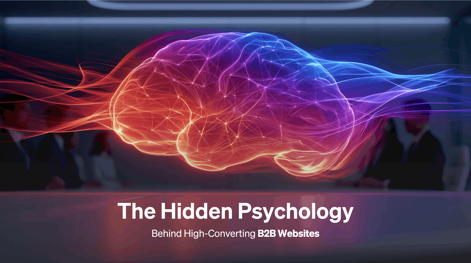
Why B2B Buyers Are Less Rational Than We Think
To build a high-converting website, we first need to understand how the brain processes information. In behavioral economics, Nobel laureate Daniel Kahneman popularized the concept of System 1 and System 2 thinking.
System 1: Fast, emotional, automatic, and subconscious.
System 2: Logical, analytical, deliberate, and slow.

An enterprise purchase utilizes both systems. However, most B2B websites make the fatal mistake of only speaking to System 2. They bombard visitors with dense feature lists, technical specifications, and dry data.
But if a visitor’s System 1 brain doesn’t feel safe within the first few seconds of landing on your site, System 2 will never stay around long enough to read your whitepapers.
Psychology Trigger #1: Authority
Humans are hardwired to look for leaders. In psychological terms, we rely on authority figures to cut through noise and validate safety. If a visitor lands on your homepage, can they identify your expertise within 5 seconds?
High-converting websites establish immediate authority without arrogance. This means placing high-value trust signals above the fold:
- Industry-recognized awards and certifications.
- Badges from platforms like G2 or Gartner.
- Thought leadership features in respected publications.
- Recognizable, market-leading client logos.
When you display clear markers of expertise early on, the buyer’s brain checks a massive box: “These people are recognized experts. I am in safe hands.”
Psychology Trigger #2: Social Proof (The Herd Behavior)
In behavioral science, Herd Behavior explains our tendency to mimic the actions of a larger group. In the context of B2B buying, it boils down to a simple truth: Nobody wants to be the guinea pig.

Before a buyer risks their corporate budget on you, they want to see that others have already done it successfully. To trigger this psychological safety net, your website must weave social proof deeply into the user journey:
- Contextual Testimonials: Place reviews near specific features or pricing tiers, rather than burying them on a single “Reviews” page.
- Hard Metrics: Instead of “We help companies scale,” use “We helped Client X achieve a 42% increase in operational efficiency.”
- Deep-Dive Case Studies: Show the before-and-after journey to let prospects see their own struggles reflected in your past successes.
Psychology Trigger #3: Cognitive Fluency (The Hidden Gem)
This is the hidden gem that most digital agencies completely overlook. Cognitive fluency is the ease with which our brains process information.
The Golden Rule of Cognitive Fluency: Humans naturally prefer and trust things that are easy to understand. If your website is hard to read, your solution feels hard to use.
Many B2B websites accidentally create immense cognitive friction by utilizing:
- Convoluted, non-standard navigation menus.
- Drowning text in heavy industry buzzwords and hollow jargon.
- Overly complex technical explanations where simple analogies would work.
High-converting websites prioritize hyper-clear messaging and intuitive UX design. When you reduce the mental effort required to understand your value proposition, you instantly increase the user’s trust in your brand.
Psychology Trigger #4: Risk Reduction
In B2B marketing, buying decisions aren’t just financial decisions, they are career decisions. The person championing your software or service within an enterprise is putting their internal reputation on the line. If the implementation fails, they take the blame. Therefore, their primary subconscious driver is often asset protection and risk aversion.
To make these buyers feel safe, your website must explicitly de-risk the purchase by mapping out:
- A Transparent Process: A clear, step-by-step breakdown of how onboarding works.
- Predictable Timelines: Removing the fear of a never-ending, budget-eating implementation cycle.
- Guarantees and Pilots: Proof of concepts or clear milestones that mitigate upfront vulnerability.
Psychology Trigger #5: Loss Aversion
Discovered by cognitive psychologists Amos Tversky and Daniel Kahneman, Loss Aversion demonstrates that the pain of losing is psychologically twice as powerful as the pleasure of gaining.
Most B2B websites frame their copy entirely around gains: “Improve your team’s conversion rates by 20%.” While appealing, it doesn’t trigger the same psychological urgency as framing the message around what they are currently losing.
Instead, reframe your value proposition to highlight the bleeding edge of their problem:
- Gain-focused (Weaker): “Optimize your supply chain efficiency.”
- Loss-aversion-focused (Stronger): “Stop losing revenue to supply chain bottlenecks.”
By shifting the narrative to what they stand to lose by not choosing you, you tap into a core human instinct to protect what is theirs.
Psychology Trigger #6: Familiarity (The Mere-Exposure Effect)
The Mere-Exposure Effect dictates that people develop a preference for things merely because they are familiar with them. In website design, familiarity breeds security.
When users encounter predictable user experiences (UX), like a navigation bar exactly where they expect it, or a standard checkout/contact flow, their brains relax.

This psychological comfort requires a unified approach to your digital presence. Maintaining a cohesive branding strategy across every page ensures your brand feels reliable, stable, and established.
The B2B Website Psychology Audit
How does your current website stack up against the human brain? Use this quick diagnostic framework to audit your site. Score yourself from 0 (Non-existent) to 5 (Mastered) for each question:
| Dimension | Audit Question | Score (0-5) |
| Authority | Do visitors see undeniable proof of your expertise above the fold within 5 seconds? | |
| Social Proof | Are your case studies backed by hard metrics and placed along the primary conversion path? | |
| Cognitive Ease | Can a non-technical person understand exactly what you do without decoding jargon? | |
| Risk Reduction | Is your onboarding process or project methodology visually mapped out on the site? | |
| Familiarity | Is your user experience predictable and backed by a cohesive design system? |
Scoring Breakdown:
- 20–25: Psychology Master. Your website is optimized for human decision-making.
- 11–19: Fragmented Experience. You have pieces of trust, but friction points are killing conversions.
- 0–10: System 2 Overload. Your site is acting as a dry corporate brochure. It’s time for a behavioral rethink.
The Growth Engine Shift
The most effective B2B websites aren’t built around a collection of static pages. They are built around the nuances of human decision-making.
When you blend the deep insights of BehaviourOS™ with intentional website design, conversion design, and brand strategy, your website undergoes a fundamental evolution. It stops acting as a passive digital business card and starts acting as a highly predictable, psychological growth engine.
Ready to discover what it takes to build a digital asset that truly converts? Explore our comprehensive breakdown of modern website costs to plan your next strategic evolution.
How to Optimize Your B2B Website for Human Psychology (Step-by-Step)
Transitioning your website from a dry corporate brochure to a psychologically optimized conversion engine doesn’t require a total overhaul overnight. Follow this actionable roadmap to align your site with human behavioral patterns.
- Simplify Your Value Proposition Above the Fold
Remove the jargon. Craft a clear headline that states exactly what you do, who you do it for, and the primary pain point you eliminate. Ensure it can be read and understood in under 5 seconds to maximize cognitive fluency.
- Map Visual Trust Anchors Immediately
Place 3 to 5 recognizable client logos, industry certifications, or major media badges directly beneath your primary hero section. This triggers an immediate System 1 confirmation of authority.
- Reframe Your Copy Using Loss Aversion
Audit your primary call-to-actions (CTAs) and feature sections. Look for instances where you only promise a “gain” and rephrase a few key areas to highlight what the buyer risks losing or wasting (e.g., time, budget, or market share) if they don’t take action.
- De-risk the Conversion Path
Right next to your primary form or contact button, add a short micro-copy line that minimizes risk perception. Examples include: “No credit card required,” “Get a response within 4 business hours,” or “20-minute strategy call, zero sales pressure.”
- Smooth Out Your User Experience (UX)
Stick to familiar web design conventions. Keep your navigation menu at the top right, use standard icon conventions, and ensure your site loads fast. Eliminating unexpected friction keeps the buyer’s brain in a relaxed, receptive state.
Frequently Asked Questions (FAQ)
While B2B buyers ultimately need logical data to justify a purchase to stakeholders or procurement teams (System 2 thinking), their initial filtering process is heavily driven by subconscious emotional factors like trust, safety, and fear of making a bad career move (System 1 thinking). If your site doesn’t pass the emotional safety test first, the buyer won’t stay to read your logical arguments.
You can minimize risk by being incredibly transparent about what happens after they click buy. Visually mapping out your onboarding framework, providing realistic implementation timelines, and highlighting success metrics from similar case studies makes the champion feel safe putting their internal reputation on the line for your solution.
Cognitive fluency is the ease with which our brains process information. If your website is filled with dense industry buzzwords, cluttered layouts, or confusing navigation, it creates mental friction. The human brain naturally equates “hard to understand” with “untrustworthy” or “difficult to work with,” causing prospects to bounce.
Loss aversion doesn’t mean being alarmist; it means being accurate about the cost of inaction. Instead of just stating the positive outcome of your software (e.g., “Increase team productivity”), gently remind them of the ongoing leak they are trying to fix (e.g., “Stop wasting hours on manual data entry”).
Rather than overwhelming a visitor with a single, massive wall of testimonials, distribute your social proof contextually. Aim for client logos above the fold to establish immediate authority, a hard-hitting metric-driven case study mid-page to validate your claims, and a human-centric quote near your final CTA to push them across the finish line.