Buckle Up for a Wild Ride in Web Design Trends
The digital landscape is ever-shifting, and web design trends are no exception. Forget predictable minimalism – 2024 is all about embracing the bold, the audacious, and the downright unexpected. Buckle up, because we’re about to dive into the top 12 trends that will have your website looking like a million bucks (figuratively, of course).
1. Maximalism Gets Meta:
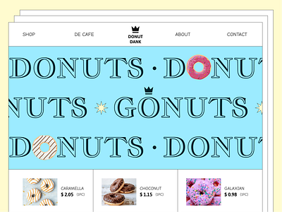
Think explosion in a glitter factory, but with purpose. Maximalism throws out the rulebook, embracing rich colors, textures, patterns, and animations to create immersive experiences. Imagine Van Gogh’s brushstrokes meets a cyberpunk rave (think neon grids and swirling fractals). Feeling overwhelmed? Don’t worry, curated chaos is the key. A sprinkle of whitespace and strategic layering keeps things from becoming an eyesore. Check out https://thefutur.com/, where they’ve mastered the art of maximalism without sacrificing user experience.
2. Heritage Revivalism: Back to the Future:

Buckle up for a nostalgia trip! Heritage revivalism draws inspiration from past eras, giving them a modern twist. Think Art Deco’s geometric elegance fused with vibrant neon palettes, or Victorian flourishes reimagined in minimalist lines. It’s all about celebrating history while keeping things fresh. For a website that blends old-world charm with cutting-edge tech, check out https://www.awwwards.com/websites/sites_of_the_year/.
3. ’80s Excess: Shoulder Pads and Neon Dreams:
Remember the decade of big hair, big music, and even bigger shoulder pads? The ’80s are back, baby! Expect to see bold typography, Memphis-inspired patterns, and a color palette that could rival a tropical sunrise. Think gradients galore, hot pink juxtaposed with electric blue, and enough neon to light up a small town. Get inspired by Neon Studio, a web design agency that perfectly captures the ’80s vibe.
4. Brand Worldbuilding: Immerse Yourself:
Websites are no longer just digital brochures – they’re entire universes waiting to be explored. Brand worldbuilding takes storytelling to the next level, creating immersive experiences that connect with users on an emotional level. Think interactive games, captivating narratives, and environments that reflect your brand’s core values. Want to see how it’s done? Dive into the fantastical world of Le Coq Sportif, where you can explore their heritage and athletic spirit through interactive storytelling.
5. AI Tools: Let the Robots Do the Dirty Work:
Remember that scene in The Terminator where Arnie learns to say “hasta la vista, baby”? That’s kind of what’s happening with AI in web design. From generating personalized layouts to optimizing content for search engines, AI is becoming an invaluable tool. Don’t fear the robot uprising – embrace it! Use AI to free up your creative energy and focus on the things that really matter.
6. Dial-up Design: Slow is the New Fast:
Remember the agonizing screech of a dial-up modem? In a world of instant gratification, the slow and deliberate aesthetic of dial-up design is making a comeback. Think chunky pixelated fonts, limited color palettes, and grainy textures. It’s a playful nod to the internet’s humble beginnings and a reminder that sometimes, less is truly more. Get inspired by https://glitch.com/ – a platform where digital artists create experimental websites that embrace the imperfections of the early internet.
7. Retrofuture Femme: Think Jane Jetson meets Blade Runner
Retrofuture femme is all about celebrating the strong, independent woman of the future. Expect to see bold typography, metallic accents, and geometric shapes with a feminine touch. Imagine chrome spaceships colliding with Art Deco skyscrapers, all rendered in a pastel color palette. Want to see it done right? Check out the website of https://leo9studio.com/, where we’re all about empowering women through bold and innovative design.
8. Gen Z Brand Speak: Talk the Talk
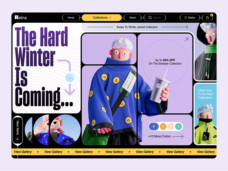
Forget stuffy corporate jargon – Gen Z brand speak is all about being authentic, relatable, and a little bit irreverent. Think emojis, slang, and inside jokes that make your target audience feel like they’re part of the club. It’s about building a community, not just selling products. Get inspired by https://www.thredup.com/login, a clothing resale platform that nails the Gen Z vibe with its playful language and relatable content.
9. Bentobox Layouting: Order in the Chaos
This trend is all about organizing content into neat, compartmentalized sections, like a Japanese bento box. Think grids, modular elements, and clear hierarchy. It’s perfect for websites with a lot of information, ensuring user-friendliness and visual appeal. Need inspiration? Check out Apple – their website is a masterclass in bentobox layout, making complex information easily digestible.
10. Toggle Switch: On or Off? You Decide
Interactive elements are always a crowd-pleaser, and the toggle switch is no exception. Think sliders, switches, and accordions that give users control over their viewing experience. Want to see how it’s done? Head over to AirBNB – their filters and search options utilize toggle switches effectively, allowing users to personalize their search for the perfect vacation rental.
11. Gigantic Buttons: Click Me If You Dare
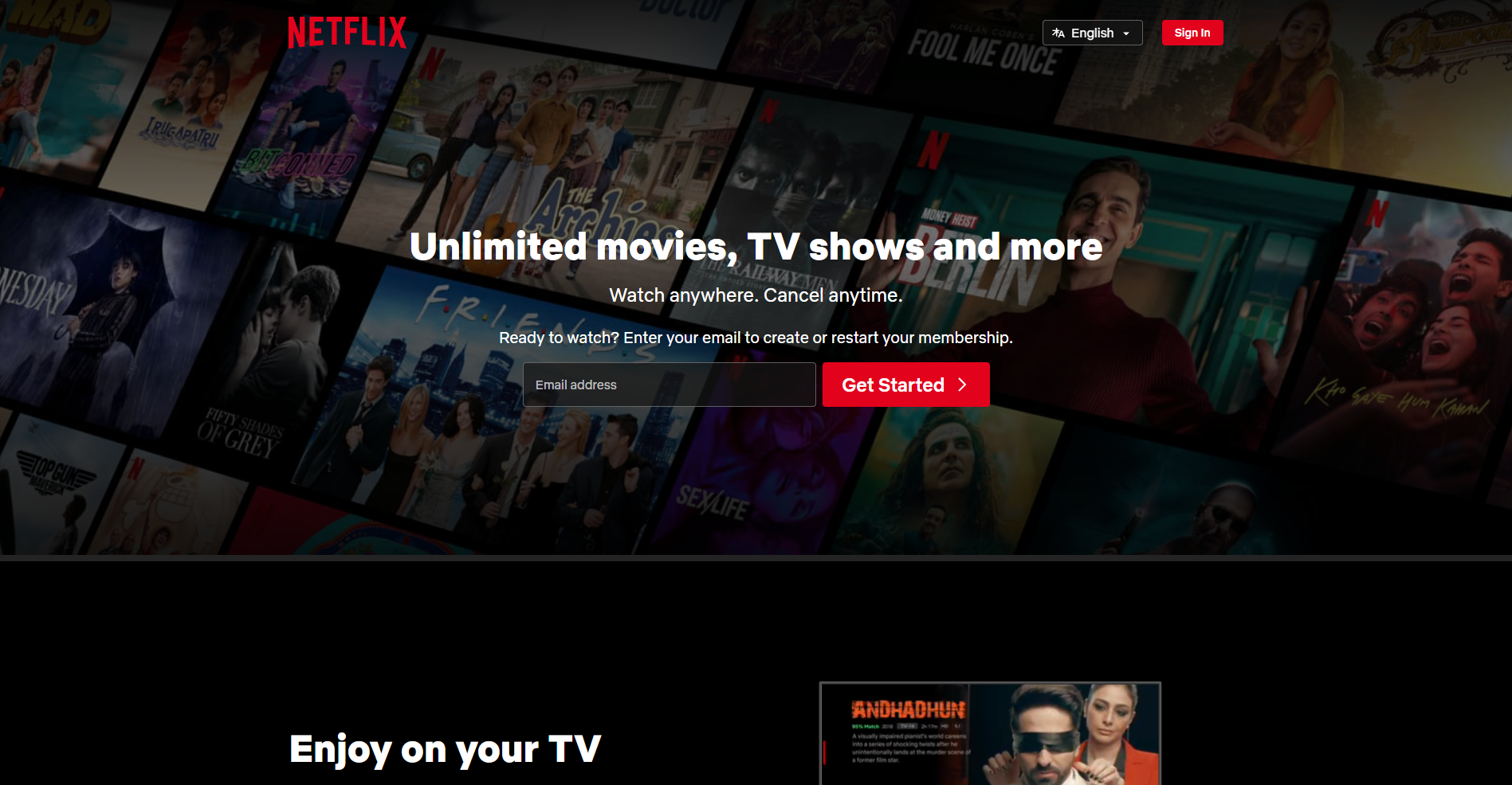
Forget those tiny, inconspicuous buttons – 2024 is all about making them big, bold, and impossible to miss. Think oversized call-to-actions that jump off the screen and beg to be clicked. Just remember, with great power comes great responsibility. Use gigantic buttons strategically to avoid overwhelming users. Need an example? Look no further than Netflix – their “Start your free trial” button is hard to ignore, yet seamlessly integrated into the design.
12. Loop Scrolling: Infinity and Beyond
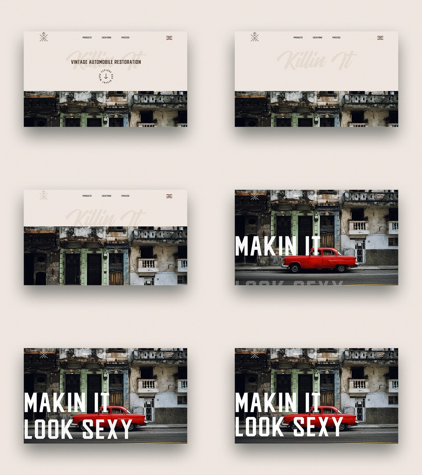
Break free from the confines of the traditional scroll! Loop scrolling creates an endless, seamless experience that keeps users engaged. Imagine scrolling through content that loops back on itself, creating a hypnotic and immersive journey. Get inspired by Google Earth – their interactive globe is a perfect example of loop scrolling done right, allowing users to explore the world without ever hitting a dead end.
Conclusion for Web Design Trends
Remember, these trends are just a starting point. The key is to use them as inspiration and adapt them to your own brand and vision. Let your creativity run wild, embrace the unexpected, and most importantly, have fun! And if you’re ever looking for a partner in web design crime, well, you know where to find us – https://leo9studio.com/contact-us.html
Check Out Some More Awesome Blog Articles:
Top 5 websites for UI UX Design Ideas That Will Turn Your World Upside Down
Super curated list of 5 websites for UI UX design ideas that will turn your world upside down. We promise you will find super interesting websites for such web design trends mentioned here!
UI Design Resources: 161 Tools User Interface Design Inspiration
Free handpicked UI design resources for your awesome projects. Curated free 161 UI design resources to energize your workflow. Bookmark this now!


