



Think about the last time you booked a flight or filled out a long, complex checkout form online. Did you breeze through it without a second thought, or did you hit a wall because an error message flashed red and yelled, “Invalid Data Entry”?
When an interface feels effortless, it isn’t just because the layout is beautiful or the colors are balanced. It feels effortless because the words are guiding you perfectly. This is the invisible power of UX writing.
Effective microcopy helps users understand interfaces, recover from errors without frustration, and complete important actions with confidence. In this comprehensive guide, we will explore practical ux writing examples to show you exactly how small, carefully chosen words can drastically improve your product’s user experience, boost conversion rates, and build brand trust.
What Is UX Writing and Microcopy?
UX writing is the specialized practice of designing the words people see and hear when they interact with software, mobile apps, or websites. It encompasses everything from the tiny label on a checkout button to the text on a 404 error page, the instructions in a form field, and the onboarding flow that introduces a new user to your app.
Microcopy refers specifically to the small snippets of text that guide users through a digital experience.
While traditional copywriting is designed to attract, persuade, and sell to a prospective customer, UX writing is designed to guide, assist, and support a user who is already inside the product.
| Feature | Copywriting | UX Writing |
| Primary Goal | Persuade and sell | Guide and assist |
| Length | Long-form (blogs, landing pages) | Short, concise (buttons, labels) |
| Tone | Promotional, engaging | Helpful, clear, empathetic |
| Metric of Success | Conversion rate, click-through rate | Task completion rate, reduced error rate |
Principles of Effective UX Writing
To create effective interface copy examples that actually move the needle for your users, you need to follow core UX writing best practices. Great microcopy doesn’t happen by accident; it relies on three foundational pillars:
1. Clarity, Brevity, and Context
Users don’t read interfaces; they scan them. Your copy must be incredibly clear, as short as possible without losing meaning, and highly relevant to the user’s current context.
- Clarity: Avoid ambiguous terms. If a button deletes an account, it shouldn’t say “Go.” It should say “Delete Account.”
- Brevity: Ruthlessly cut filler words. Change “Please click here to confirm your email address” to simply “Confirm Email.”
- Context: Deliver the right message at the exact moment the user needs it. Don’t explain how to use a feature three screens before the user actually sees it.
2. Consistent Voice and Tone
While your brand’s voice (your brand’s personality) should remain consistent across the application, your tone (your emotional inflection) should adapt to the user’s current situation.
- A success message after completing a long setup process should sound celebratory and upbeat.
- A payment failure notice or a server outage message needs to sound empathetic, serious, and reassuring. Humor has no place in an error message where a user thinks they just lost money.
3. Inclusive and Accessible Language
Good UX writing is accessible to everyone. Avoid internal company jargon, cultural idioms that don’t translate globally, and overly complex sentence structures. Accessible copy ensures that non-native speakers, neurodivergent users, and individuals using screen readers can navigate your product seamlessly.
UX Writing Examples by Interface Type
Let’s look at some of the most common UX microcopy examples across different parts of a digital product.
Forms, Labels, and Helper Text
Forms are high-friction areas. Every input field is an obstacle between the user and their goal. Good microcopy reduces anxiety by explaining why information is needed and how to format it.
- Bad: “Phone Number” (User thinks: Why do they need my number? Will they spam me?)
- Good: “Phone Number (We’ll only use this to send secure delivery updates)”
Error Messages and Validation
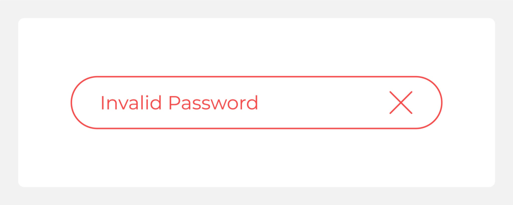
Error messages should never make the user feel stupid. They should clearly state what went wrong, avoid blaming the user, and immediately explain how to fix the issue.
- Bad: “Invalid Input: Error 409X.” (Technical jargon that provides no solution).
- Good: “This email is already registered. Would you like to sign in instead?”
Onboarding Screens and Tooltips
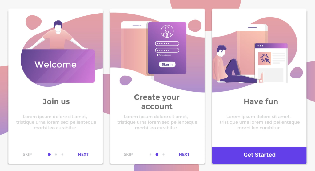
Onboarding sets the tone for the entire user relationship. It should focus on the value the user will get, rather than just treating them like a manual on how the app works.
- Bad: “Click the plus icon to add a project.”
- Good: “Ready to get started? Create your first project to organize your tasks.”
Empty, Loading, and Success States
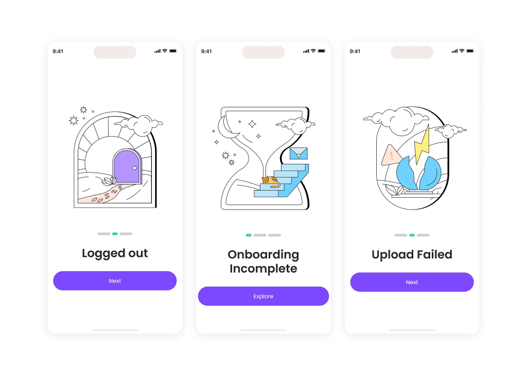
Empty states (what a user sees when there is no data yet) are a massive missed opportunity for many apps. Instead of just showing a blank screen, use this real estate to educate and encourage action.
- Bad: “No messages found.”
- Good: “Your inbox is empty right now. When your team mentions you, the notifications will appear here.”
Before-and-After UX Writing Examples
Seeing the transformation is the best way to understand how to apply UX writing best practices. Here are three common scenarios:
1. Replacing Vague Copy with Clear Instructions
Imagine a user trying to pay for a subscription, but their credit card is declined.
- Before: “System error. Transaction failed.” (Panic-inducing and unhelpful).
- After: “We couldn’t process your payment. Please check your card’s expiration date and try again.” (Calm, explanatory, and actionable).
2. Rewriting Blame-Based Messages into Helpful Guidance
Software should take the blame, not pass it to the user.
- Before: “You entered the wrong password.” (Accusatory).
- After: “That password doesn’t match our records. Need to reset it?” (Helpful and offers an immediate solution).
3. Making CTAs Specific and Action-Led
CTAs must set clear expectations so users know exactly what happens when they click.
- Before: “Next” (on a shopping cart checkout screen).
- After: “Review Order” (The user now knows they aren’t paying yet; they get to look over their items first).
(Looking for more deep-dive inspiration? Check out these excellent ux writing examples from the UX Design Institute to see how top global brands handle interface copy.)
How to Test and Improve UX Copy
Great UX writing isn’t based on a copywriter’s intuition; it’s based on research, user behavior, and data. If you want to refine your microcopy, follow these procedural steps:
- Conduct a Content Audit: Identify the baseline.
Review your current interface copy screen by screen. Document all error messages, empty states, and CTAs in a spreadsheet to identify inconsistencies in voice, tone, or clarity.
- Run Comprehension Testing: Observe real users.
Use tools like highlighter testing, or sit down with users and ask them to read your app’s copy out loud. Ask them to explain what they think a button will do before they click it. If they hesitate, the copy needs a rewrite.
- Implement A/B Testing: Let data decide.
Test two different variations of a CTA or onboarding screen on live traffic. For instance, test the button text “Sign Up” versus “Get Started” to see which phrase drives a higher conversion rate.
- Analyze the Analytics: Find the friction points.
Look closely at your user drop-off rates. If users consistently abandon a flow at a specific form field (like asking for a phone number), the microcopy on that field likely needs more context and clarification.
Common UX Writing Mistakes
Even experienced product teams make mistakes when it comes to text. Avoid these common pitfalls to keep your interface clean and user-friendly:
- Using internal database jargon: Your users don’t care about your internal code. Don’t say “Query returned 0 results” when you can say “We couldn’t find any matches.” Speak their language.
- Sacrificing clarity for cleverness: Humor is great, but not if it confuses the user. Always prioritize clarity over being witty. A funny error message is useless if the user doesn’t know how to fix the error.
- Writing copy at the very end: Microcopy should be designed with the interface, not squeezed into a finalized layout as an afterthought. “Lorem Ipsum” is the enemy of good UX design.
FAQs on UX Writing Examples
Effective UX writing is clear, concise, and highly useful. It anticipates the user’s needs, reduces cognitive load, and guides them smoothly from point A to point B without making them overthink their actions.
Copywriting is focused on marketing, persuasion, and acquiring customers. UX writing is focused on usability, interface navigation, and helping the user accomplish a specific task once they are already using a product.
Error messages should avoid technical jargon, completely remove the blame from the user, clearly explain what went wrong in plain English, and provide a direct, clickable path to resolve the issue.
A strong CTA starts with a powerful verb and clearly sets expectations. Instead of using generic, invisible terms like “Click Here” or “Submit,” it should describe the exact resulting action, such as “Download PDF,” “Start Free Trial,” or “Send Message.”
Teams can test microcopy through live A/B testing on their platforms, comprehension testing with target users to measure understanding, and usability testing to observe if users hesitate on specific screens.
Conclusion
Every single word in your digital interface is a vital part of the user experience design. The difference between an app that users love and an app that frustrates them often comes down to the microcopy. By studying these ux writing examples, you can start auditing your own product to find areas where clarity can replace confusion, and where empathy can replace frustration.
Remember, the very best interface copy is often the copy that goes entirely unnoticed—because it feels so completely natural to the user that they simply flow through your product.
If you need help auditing your product’s flow, redesigning your interface, or creating seamless user experiences from scratch, explore how the design experts at Leo9 Studio can elevate your digital product to the next level.