


12 Patterns to Recognize the Dark UX
Have you ever been fed up of trying to unsubscribe through a lengthy process, so much so that you just decided to ignore the emails?
While shopping online, did unexpected charges pop up out of nowhere while completing the last step of the payment procedure?
Have you ever been denied the returning of a product that you bought online, after being promised one in case of any issues?
If you’ve been through any of these situations, you’ve been through the Black e-magic: Dark UX.
The definition of dark UX, according to Harry Brignull, the UX practitioner who coined the term is:
“A user interface that has been carefully crafted to trick users into doing things..they are not mistakes, they are carefully crafted with a solid understanding of human psychology, and they do not have the user’s interests in mind.”
Dark UX has various dark patterns through which it stealthily functions.
What are Dark Patterns?
A dark pattern is a user interface that has been carefully crafted to trick users into doing things. For instance, signing up for recurring bills.
User Experience (UX) designer Harry Brignull coined the neologism on 28 July 2010 with the registration of darkpatterns.org, a “pattern library with the specific goal of naming and shaming deceptive user interfaces”.
Dark UX patterns are tricks used in websites and apps that make you do things that you didn’t mean to, like buying or signing up for something.
In 2016 and 2017 research has documented social media anti-privacy practices using dark patterns. In 2018, the Norwegian Consumer Council (Forbrukerrådet) published “Deceived by Design”, a report on deceptive user interface designs of Facebook, Google and Microsoft. A 2019 study investigated practices on 11,000 shopping websites. It identified 1818 dark patterns in total and grouped them into 15 categories.
How does Dark UX Work?
Well, it works quite in the dark. That is, the user is deceived, manipulated and kept in the dark about the actual situation.
When you use websites and apps, you don’t read every word on every page – you skim read and make assumptions. If a company wants to trick you into doing something, they can take advantage of this by making a page look like it is saying one thing when it is in fact saying another. You can defend yourself by staying aware and informed about Dark UX and its various types.
Trick questions
While filling in a form you respond to a question that tricks you into giving an answer you didn’t intend. When glanced upon quickly the question appears to ask one thing, but when read carefully it asks another thing entirely.
Another common dark pattern amongst checkboxes is double negatives – language that makes the user unsure whether to tick or to untick. Here’s a great example…
Sneak into Basket
You attempt to purchase something, but somewhere in the purchasing journey the site sneaks an additional item into your basket, often through the use of an opt-out radio button or checkbox on a prior page.
Sports Direct is a high profile abuser of this dark pattern. In the past a ‘free’ mug and Sports Direct magazine (£1 delivery charge) have been added to customer baskets online, without any notification.
Though the retailer has now added a pop-up offering the ‘free’ mug to users, note how inconspicuous the ‘no thanks’ text is compared to the large white ‘yes please’ button.
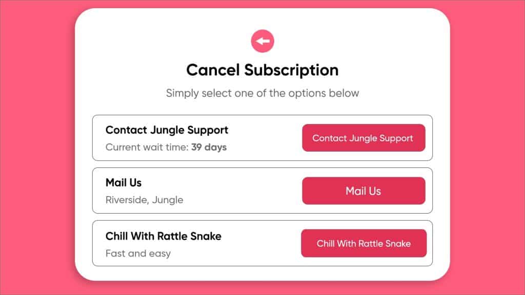
Roach Motel
This type of dark pattern is pretty common and fairly relatable by all. You get into a situation very easily, but then you find it is hard to get out of it! For example, a subscription.
The IIIM Jobs website is a perfect example. It’s a painfully long process to unsubscribe their daily mails. It’s been years with their unwanted emails.
Privacy Zuckering
You are tricked into publicly sharing more information about yourself than you really intended to. Named after Facebook CEO Mark Zuckerberg.
Let’s take the infamous example of Facebook. Facebook shares user data with advertisers by default. Users must change settings manually to opt-out.
Price Comparison Prevention
The retailer makes it hard for you to compare the price of an item with another item, so you cannot make an informed decision.
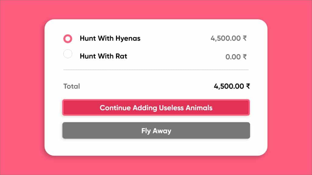
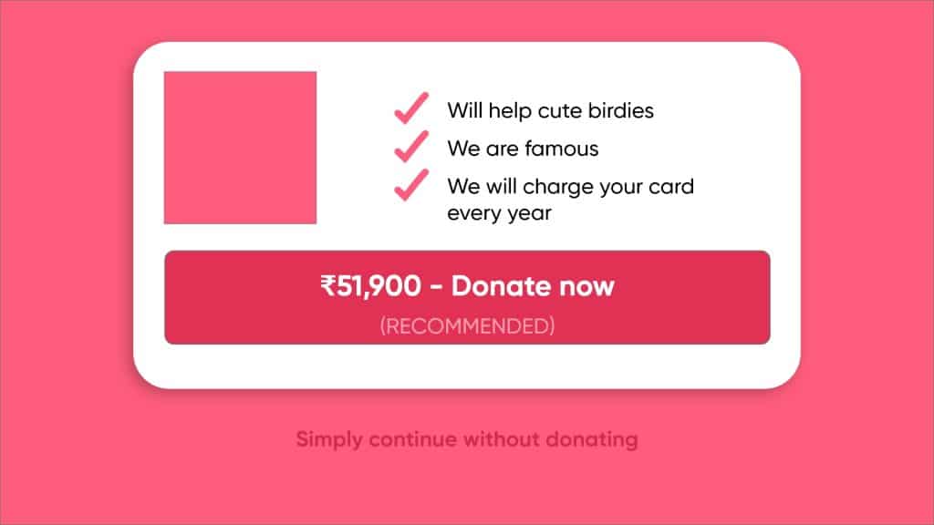
Misdirection
The design purposefully focuses your attention on one thing in order to distract your attention from another.
In the screenshot below you can see how the ‘add to basket with donation’ red button appears to suggest moving forward to the next stage of the checkout. The lost CTA to continue ‘without donation’ button points backward, leaving the unobservant user to assume this is some sort of back arrow to return to a previous page.
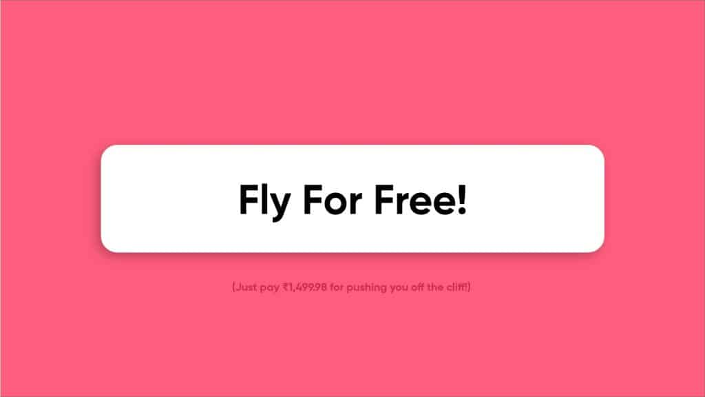
Hidden Costs
You get to the last step of the checkout process, only to discover some unexpected (and surprisingly high) charges have appeared, e.g. delivery charges, tax, etc.
Bait and Switch
Bait-and-switch scams appeal to people who want to save money. A company offers a compelling deal, to draw customers to the business. When the customer contacts the business and finds that the deal is not available, the company then tries to convince the customer to buy something else, assuring them that they are still receiving a good deal.
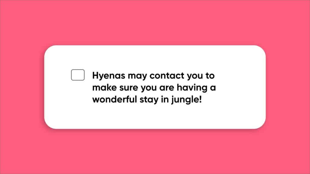
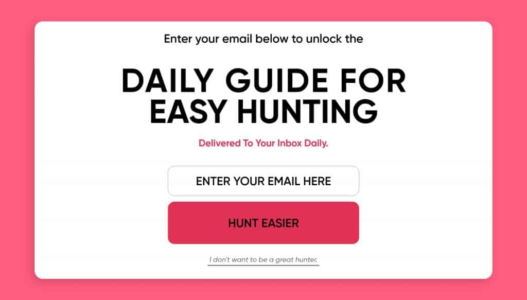
Confirmshaming
The act of guilting the user into opting into something. The option to decline is worded in such a way as to shame the user into compliance.
Here is an image providing a classic example of confirmshaming.
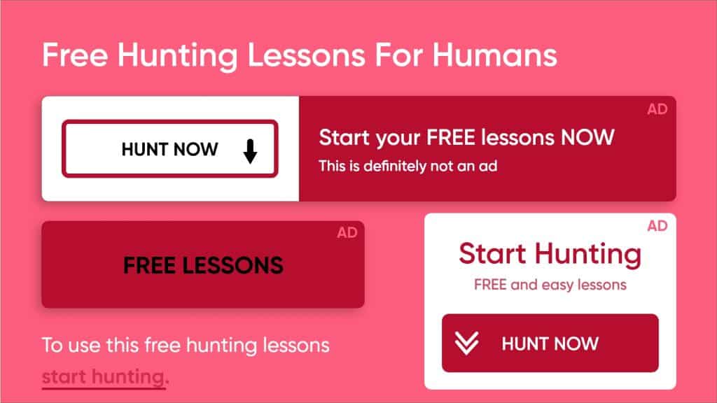
Disguised Ads
Advertisements that are disguised as other kinds of content or navigation, in order to get you to click on them.
Forced Continuity
When your free trial with a service comes to an end and your credit card silently starts getting charged without any warning. In some cases this is made even worse by making it difficult to cancel the membership.
How does that happen?
The user is asked to give their credit card or payment information for a free trial or a web service/benefit and the supplier hides the ‘subscription renews automatically’ info or makes it very hard to cancel the automatic renewal.
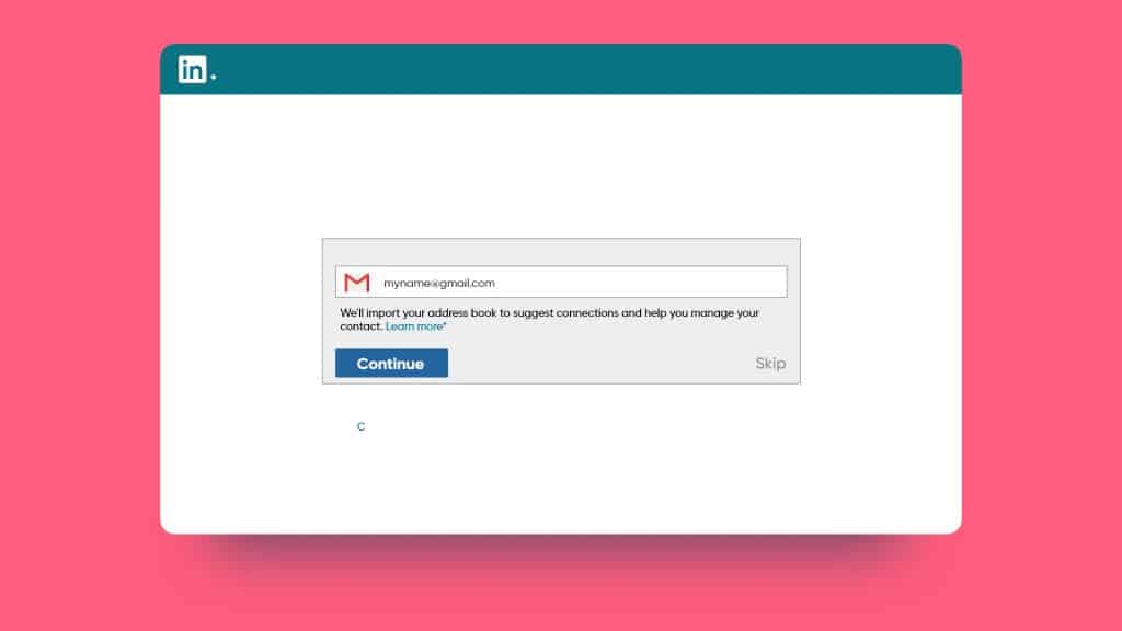
Friend Spam
The product asks for your email or social media permissions under the pretence it will be used for a desirable outcome (e.g. finding friends), but then spams all your contacts in a message that claims to be from you.
LinkedIn was behind what has become the best-known example of Friend Spam. During the registration process, LinkedIn asked users to grant access to their email accounts, claiming that doing so would boost the new user’s career prospects by creating a “strong network”. In actuality, LinkedIn then used the new user’s email address to send invitation emails to all of their contacts. Linkedin had to cough up $13 million damages in 2015!
Now that we’ve chanted “Lumos!” and have enlightened ourselves about Dark UX and its patterns, stay tuned to stay informed about more of such crucial knowledge.
Read More Blogs
Learn awesome hacks of design thinking in just 4 minutes. Learning and applying these awesome hacks will help you have a great kick start!
The Best Web Design Practices to ensure business growth are here. Click now to figure out the top 10 Best Web Design practices of the year 2020.
Super curated list of 5 websites for UI UX design ideas that will turn your world upside down. We promise you will find interesting websites!