



A website is rarely experienced on one screen anymore. Users move between smartphones, tablets, laptops, desktops, and different browser environments throughout the day. That makes responsive web design more than a technical requirement. It is a UX decision that determines how easily people can navigate, read, interact with, and trust a digital experience.
In 2026, effective responsive website design goes beyond shrinking desktop layouts for smaller screens. It considers content hierarchy, accessibility, performance, touch interactions, and user behaviour from the start.
What Is Responsive Web Design?
Responsive web design is an approach to designing and developing websites so their layouts, content, images, and interactions adapt to different screen sizes and devices.
Instead of creating separate experiences for desktop and mobile, a responsive website uses flexible layouts, fluid grids, responsive images, and CSS media queries to adjust the interface according to the available screen space.
The goal of responsive website design is simple: users should be able to complete the same important tasks comfortably, regardless of the device they use.
Why Is Responsive Web Design Important?
A website that works beautifully on a desktop but becomes difficult to navigate on mobile creates friction at exactly the wrong moment. Users may struggle with tiny buttons, excessive scrolling, unreadable text, or broken layouts.
Good mobile responsive design reduces these problems by adapting the experience to the user’s context. It can also support better engagement because users spend less effort figuring out how an interface works.
Responsive experiences also make maintenance easier than managing multiple device-specific websites. One flexible system can support multiple screen sizes while maintaining visual and functional consistency.
Key Principles of Responsive Web Design
The core responsive web design principles are straightforward, but applying them well requires careful UX thinking.
Fluid layouts: Use flexible grids and relative units rather than designing around one fixed screen width.
Flexible media: Images and videos should scale within their containers without becoming distorted or unnecessarily large.
Responsive typography: Font sizes, line heights, and spacing should remain readable across screen sizes.
Content hierarchy: Prioritise the information users need most. A mobile screen cannot accommodate everything with equal visual weight.
Touch-friendly interactions: Buttons, links, forms, and navigation elements should have enough space for comfortable interaction.
Progressive enhancement: Start with a strong functional experience and enhance it for devices and browsers with greater capabilities.
These responsive design principles help ensure that responsiveness supports usability rather than becoming a purely visual exercise.
How to Create a Responsive Website
- Start with the User, Not the Device List
Understand what visitors need to accomplish, which content matters most, and where friction could occur.
- Establish a Flexible Layout System
A responsive design framework can provide useful structures for grids, breakpoints, components, and spacing, but it should not dictate the entire experience. The framework needs to serve the product and its users.
- Design Key Journeys Across Multiple Screen Sizes
Navigation, forms, product pages, calls to action, and complex interactions often behave very differently on mobile.
- Prototype, Develop, Test, and Refine
This is where responsive design techniques become practical rather than theoretical. Test real interactions instead of assuming that a layout will work because it looks correct in a design file.
Responsive Web Design Examples
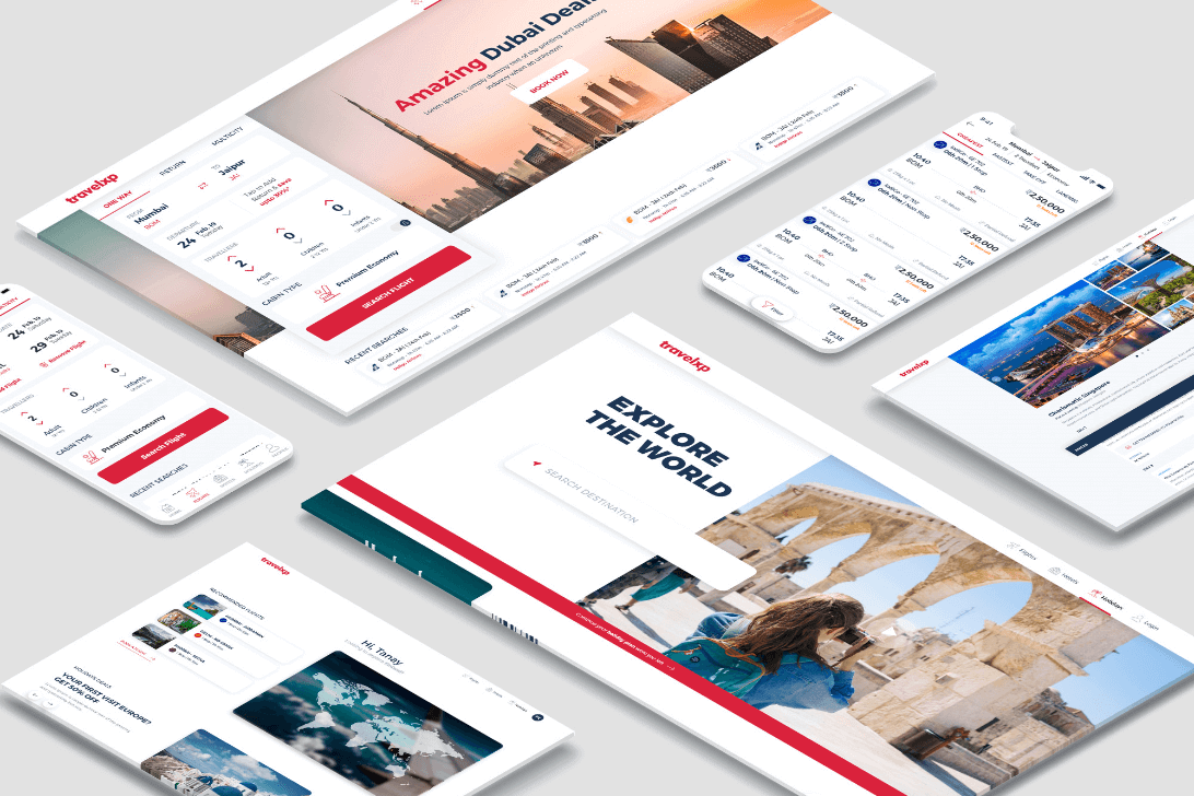
Leo9 Studio customized holiday booking experience for Travelxp. We enhanced UI/UX and designed and developed mobile app and website.
Some of the most useful responsive design examples are not necessarily visually dramatic. They are websites where the interface quietly adapts without making the user think about the adaptation.
An ecommerce website may shift from a multi-column product grid to a two-column mobile layout while preserving filters and purchasing actions. A financial platform may transform a dense desktop dashboard into prioritised cards on smaller screens. A content-heavy website may simplify navigation and restructure its information hierarchy for mobile readers.
These examples demonstrate an important point: mobile responsive design should not mean simply making everything smaller. It should mean reconsidering how information and interactions work within a smaller context.
Responsive Web Design Best Practices
The most useful responsive design best practices combine visual flexibility with strong UX fundamentals.
- Design mobile-first where it makes sense for the audience and product.
- Use content-driven breakpoints rather than designing for arbitrary device models.
- Keep navigation predictable across screen sizes.
- Optimise images and assets to protect loading performance.
- Maintain readable typography and adequate spacing.
- Design accessible forms and sufficiently large touch targets.
- Use reusable components and a consistent design system.
- Test real content rather than placeholder text.
- Consider performance as part of UX, not as a separate technical task.
A good responsive design framework can support consistency, but reusable components, clear guidelines, and thoughtful design decisions are what make a system scalable.
Common Responsive Web Design Mistakes to Avoid
One common mistake is treating mobile as an afterthought. Another is using too many breakpoints, which can make layouts difficult to maintain.
Other problems include hiding essential content on mobile, using oversized images, creating tiny tap targets, relying on hover interactions, and allowing desktop navigation patterns to dominate small screens.
Poor performance is another frequent issue. A responsive website can technically fit every screen while still delivering a frustrating experience if it loads slowly or shifts unexpectedly.
How Responsive Design Impacts UX and SEO
Responsive design directly influences usability. When content remains readable and interactions remain predictable, users can move through a website with less cognitive and physical friction.
It also supports SEO by providing a consistent URL and content experience across devices. Search visibility, however, is not created by responsiveness alone. Technical performance, useful content, accessibility, information architecture, and other search factors also matter.
The relationship between UX and SEO is therefore practical: a website designed around real user needs is easier to navigate, understand, and interact with.
How to Test a Responsive Website
Testing should cover more than checking a few predefined screen sizes.
Review layouts across mobile, tablet, laptop, and desktop widths. Test navigation, forms, menus, buttons, images, typography, scrolling, and interactive states. Check both portrait and landscape orientations where relevant.
Use browser developer tools for initial checks, but test on physical devices as well. Analytics, usability testing, session recordings, and performance measurements can reveal problems that visual inspection misses.
This is where responsive design techniques become measurable. Instead of asking whether the website looks responsive, ask whether users can complete their tasks easily.

Conclusion: Building Better Responsive Websites
Responsive web design is ultimately about creating digital experiences that adapt without compromising clarity or usability. The strongest responsive website design combines flexible technology with thoughtful UX, content hierarchy, accessibility, performance, and behavioural understanding.
Rather than designing one desktop experience and squeezing it onto smaller screens, teams should build systems that anticipate how people actually interact with digital products. That means using the right responsive design principles, applying practical responsive design best practices, and continuously testing the experience across contexts.
In 2026, responsiveness is no longer simply about fitting a website onto a phone. It is about making every interaction feel intentional, wherever it happens.
FAQs About Responsive Web Design
Responsive web design is an approach where website layouts, content, images, and interactions automatically adapt to different screen sizes and devices.
The main responsive web design principles include fluid layouts, flexible media, responsive typography, clear content hierarchy, touch-friendly interactions, accessibility, and performance-conscious design.
Responsive design uses flexible layouts that continuously adjust to screen dimensions. Adaptive design typically uses predefined layouts designed for specific screen sizes or device categories.
Responsive design helps websites remain usable and consistent across devices. It is particularly important when a significant portion of users access a website through smartphones and tablets.
Yes. Responsive design supports a consistent website experience across devices and can contribute to better usability and technical performance. However, SEO also depends on content quality, technical health, accessibility, site structure, and other factors.
Use flexible grids, responsive images, CSS media queries, scalable typography, accessible components, and appropriate breakpoints. A responsive design framework can speed up implementation, but the design still needs to be tested against actual user journeys.
Common responsive design examples include ecommerce stores that adapt product grids for mobile, financial platforms that restructure dashboards, and content websites that simplify navigation and prioritise information on smaller screens. These experiences demonstrate how mobile responsive design can adapt functionality instead of merely reducing dimensions.