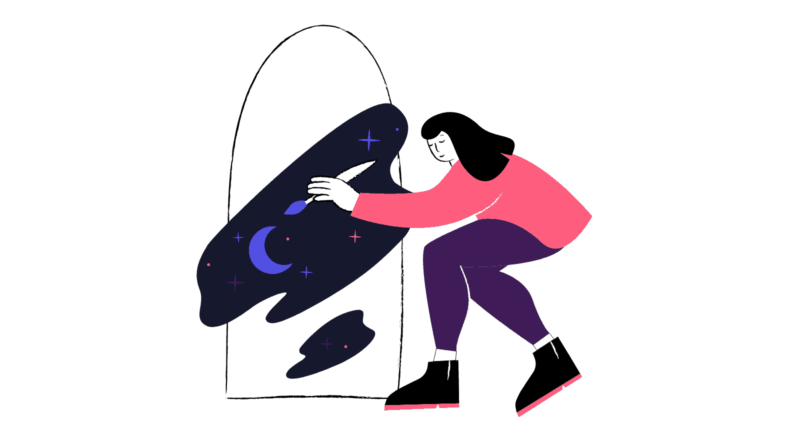
Introduction to the Dark Mode:
Recently, there has been a lot of hype around benefits of dark mode and backgrounds. Every website has introduced or plans to introduce a dark mode switch or a simple toggle to change their website’s background theme to black. You can notice a considerable increase in the number of websites, apps, products that have started offering a dark mode option to their users since there has been a rising demand for this unique style in the market.
With the ever-changing technology, the way users interact with websites has been changing in terms of the devices available to access the sites and the amount of time they spend interacting. Even Twitter, Facebook Messenger, Mac OS and Windows have started offering dark modes. It’s not hard to guess that web designers won’t take long to follow suit if these giants have adopted it.
There is no denying that light backgrounds for websites have been a universal trend to date, as people find it more appealing and better in terms of readability. Then, what are the benefits of a dark mode on a website? Why is it gaining so much popularity these days?
What is Dark Mode?
In simple terms, dark mode or dark theme is a dark background with light-colored text. It uses a dark color—usually black or gray as the primary background color. It is the complete reversal of the default white UI that web designers have been using for ages. In today’s world, user preferences are changing, and an increasing number of websites are experimenting with their interfaces for aesthetic purposes or addressing their viewers’ demands.
Web Design Trends of 2020 – 21 and Dark Mode
It was highly trending design trend even in 2020! Dark Mode has design benefits too, like
1. Dark Mode looks ultra-modern.
2. It allows highlighting and popping other design elements.
Brands like Instagram, Apple, and Android offer Dark Mode as an alternative theme in their products. With 0 doubts, it is hottest web design trends for 2020
The Benefits of Dark Mode
1. Reduces eye strain and increases visibility in low-ambient lighting
People in professions where they have to expose themselves to long screen hours often start to face eye strain after a certain time period. Computer Vision Syndrome (CVS) includes the following symptoms: eye pain, double vision, headaches, blurred vision, neck & back pain and much more. The lowered brightness in the dark mode is much easier on the eyes, thus reducing eye strain and increasing the natural release of melatonin, leading to better sleep. Especially if you work late hours or early in the morning, the dark mode can benefit your eye health.
Dark mode diminishes the bright light and makes it easier for you to view content in low light situations. When people use mobile phones or laptops during bedtime, it can disrupt their body’s natural cycle, but dark modes can reduce the damage. This is the reason many social media platforms have started offering an option to switch to dark mode.
2. Battery saving
Many digital gadgets with OLED screens turn off the black pixels when they are not being used. Since dark mode uses many black pixels, it saves your device’s battery life by using less energy.
3. Aesthetic boost and better user experience
For certain industries and sectors, dark mode is a better choice. For instance, brands focused on nightlife and entertainment are a perfect match for a dark colored website. Moreover, if a brand’s existing color scheme is already compatible with the dark mode, it is a win-win situation. A content-heavy website is usually not dark mode–compatible; rather, a minimalistic design with limited content but higher graphic content is the best bet for dark mode. Black is often associated with elegance, power and stature. Hence, if you want to use your website as a status symbol, consider dark mode UI. If your website hosts many graphs and charts, a dark background will certainly offer a better user interface. All colors pop up better on dark backgrounds. Black provides good contrast for all colors, thus, enhancing your website’s look and feel. You should use colors with high contrast between the text or images and the background. A black/gray background provides better contrast with most colors, certainly more than a white background does.
4. Prevents Attention Deficit Disorder (ADD)
White colors and backgrounds usually make you lose focus and attention, making it challenging for you to stay on your task. On the contrary, dark modes can increase your focus by directing your attention towards the content displayed on the site due to the high contrast between the text and background color, thereby letting the content pop and the background disappear.
Conclusion

The dark mode revolution is still fresh, and lots of websites are still getting updated. This means it’s the perfect time to go dark and create a unique advantage for your brand. Choosing the right background is very important in website designing, so think it through before deciding your website’s theme. A dark background can give you a fair edge over your competitors and increase traffic to your website.
Visit this UI UX Design Agency to check out dark mode on a website!
Also Read:
Read how businessmen must use UX design and enhancement of motivation for better business leads. Reveal the secret now!
What is a content marketing strategy? How do design strategies to achieve your business goals? Learn all about content marketing strategy now!
Start an online business, learn some unique and common steps as starting a brick-and-mortar business! Start your online business today!


