



Small interactions can make a significant difference in how users experience a digital product. A button that responds to a click, a subtle loading animation, or a notification confirming an action can make an interface feel more intuitive and responsive. Microinteraction design focuses on these small but meaningful details, helping users understand system feedback, navigate interfaces, and complete tasks with confidence. This article explores how microinteractions work, their role in UX, practical examples, and best practices for designing more engaging digital experiences.
What Is Microinteraction Design?
Microinteraction design is the practice of creating small, focused interactions that help users understand and respond to interface elements. These interactions usually happen when users perform a specific action, such as clicking a button, submitting a form, liking a post, or adjusting a setting.
Unlike major interface components, microinteractions operate at a smaller level. However, they play an important role in making digital products feel responsive, predictable, and easy to use. Effective microinteraction design connects user actions with clear visual or functional feedback.

What Is a Microinteraction in UI and UX?
A microinteraction in UI and UX is a small interaction designed to communicate feedback or support a particular task. It typically responds to a user’s action or a change in the system.
For example, when a user switches on dark mode, the interface changes its appearance. Similarly, a shopping cart icon may display an updated item count after a product is added.
These UI microinteractions communicate that an action has been recognised and processed. While UI microinteractions focus on visible interface responses, UX microinteractions also consider how these responses influence usability, clarity, and user confidence.

Why Microinteractions Matter in Digital Products
Small interface responses can influence how users perceive an entire digital product. Without feedback, users may wonder whether an action has worked or whether they need to repeat it.
Well-designed microinteractions in UX help address this uncertainty while making digital experiences more engaging.
Their key benefits include:
- Provide immediate feedback: Users understand whether their actions have been registered.
- Improve usability: Visual cues make navigation and interface functionality easier to understand.
- Reduce uncertainty: Loading indicators, confirmation messages, and error notifications communicate system status.
- Create emotional engagement: Thoughtful animations and responses make interactions feel more natural.
- Strengthen brand personality: Consistent interaction patterns can reinforce a product’s visual identity.
- Prevent user errors: Clear feedback can guide users towards the correct actions.
From a business perspective, these improvements can reduce friction across important user journeys, including registrations, purchases, and onboarding.
The Four Parts of a Microinteraction
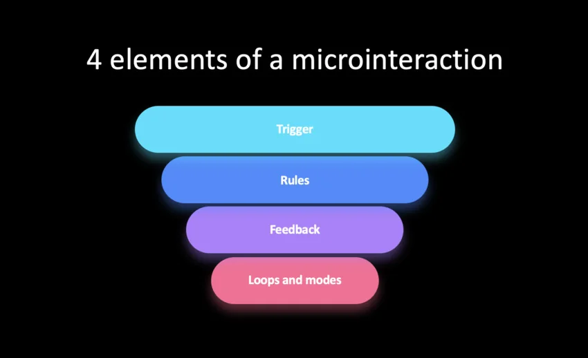
According to interaction designer Dan Saffer, a microinteraction consists of four essential parts: trigger, rules, feedback, and loops and modes. Understanding these elements helps designers create interactions that feel purposeful.
1. Trigger
A trigger initiates the microinteraction. It can come directly from a user action or from a system event.
For example, clicking a notification icon or receiving a new message can trigger an interaction.
2. Rules
Rules determine what happens after the trigger. They define how the system responds and what conditions influence the interaction.
For instance, clicking a favourite icon changes its state from inactive to active.
3. Feedback
Feedback communicates the result of the interaction. It can include colour changes, animations, sounds, vibrations, or confirmation messages.
A button changing colour after a click is a simple example.
4. Loops and Modes
Loops determine how an interaction behaves over time, while modes describe different states or conditions.
For example, a notification may disappear after a few seconds, while a toggle switch can maintain its selected state until the user changes it.
Microinteraction Design Examples
Practical examples make it easier to understand how small interface responses improve digital experiences. Here are some commonly used microinteraction examples across websites and applications.
- Button interactions: A button may change colour, display a pressed state, or show a loading indicator after being clicked. These button microinteractions reassure users that the system has registered their action.
- Like and favourite animations: Social media platforms often use small animations when users like a post. The response makes the action more noticeable and satisfying.
- Form validation: When users enter incorrect information, a form can highlight the relevant field and display a helpful error message. Successful submissions may trigger a confirmation animation.
- Loading indicators: Progress bars, spinning icons, and skeleton screens communicate that content is loading or an action is being processed.
- Shopping cart updates: Adding an item to a cart may trigger a subtle animation or update the cart icon’s item count.
- Toggle switches: Switching between light and dark modes often involves a small visual transition that communicates the selected setting.
- Password visibility controls: Tapping an eye icon changes the password field from hidden to visible, helping users verify their input.
These microinteraction examples demonstrate how small design decisions can make everyday tasks easier without adding unnecessary complexity.
Microinteraction Design Best Practices
Effective microinteractions should support usability rather than compete with the main interface. Following established microinteraction design principles can help designers create purposeful and consistent experiences.
- Keep interactions purposeful: Every interaction should communicate something useful or support a specific user action. Avoid animations that add no functional value.
- Provide immediate feedback: Users should receive a clear response after interacting with an interface element. Delayed feedback can create uncertainty.
- Maintain consistency: Use similar visual responses for similar actions across the product. Consistent patterns make interfaces easier to learn.
- Keep animations subtle: Micro animations should feel natural and should not distract users from their primary tasks.
- Respect accessibility: Consider reduced-motion preferences, sufficient colour contrast, keyboard interactions, and screen-reader compatibility.
- Consider timing: Animations should be quick enough to maintain flow but long enough to communicate the intended change.
- Design for different devices: Ensure interactions work consistently across desktop, tablet, and mobile interfaces, including touch-based controls.
These microinteraction best practices help maintain a balance between visual appeal, functionality, and accessibility.
How to Design a Microinteraction
Creating an effective microinteraction requires understanding the user action, the intended response, and the context in which the interaction occurs.
A practical design process includes:
- Step 1: Identify the user action
Start by identifying a specific action that needs feedback. It could be submitting a form, selecting an option, or adding an item to a cart.
- Step 2: Define the expected response
Determine what users should see or experience after performing the action. The response should communicate the result clearly.
- Step 3: Establish interaction rules
Define the different states, conditions, and behaviours. Consider what happens during successful actions, errors, repeated clicks, or interruptions.
- Step 4: Create the visual response
Develop the interaction using transitions, colour changes, icons, or other interface elements. Keep the design consistent with the product’s visual language.
- Step 5: Prototype and test
Use interactive prototypes to evaluate timing, visibility, and usability. Gather feedback to identify confusing or unnecessary interactions.
- Step 6: Refine and implement
Make improvements based on testing and ensure the interaction works across supported devices and accessibility settings.
This process connects interaction design with actual user needs instead of treating animations as purely decorative elements.
Common Microinteraction Design Mistakes
Even small interactions can negatively affect usability when they are poorly implemented. Some common mistakes include:
- Overusing animations: Too many moving elements can distract users and increase cognitive load.
- Providing unclear feedback: An interaction that changes appearance without communicating its purpose can confuse users.
- Ignoring accessibility: Rapid animations, poor contrast, and interactions that depend only on colour can exclude some users.
- Inconsistent behaviour: Different responses for similar actions make interfaces harder to understand.
- Adding unnecessary delays: Long transitions can interrupt workflows and frustrate users.
- Ignoring mobile interactions: Hover-based responses may not work on touchscreens.
Good design requires knowing when an interaction adds value and when a simple, static response is more effective.
How to Evaluate Microinteraction Effectiveness
Microinteractions should be evaluated based on how well they support user actions and improve the overall experience.
Designers can assess their effectiveness through:
- Task completion rates: Check whether users can complete actions successfully.
- Interaction errors: Monitor incorrect inputs, repeated clicks, and failed actions.
- Usability testing: Observe whether users understand the purpose and response of each interaction.
- Engagement metrics: Track relevant actions such as button clicks, form submissions, and feature usage.
- User feedback: Collect qualitative feedback about clarity, responsiveness, and ease of use.
- Performance testing: Check whether animations affect loading times or interface responsiveness.
A/B testing can also help compare different interaction patterns. For example, designers can test whether an animated CTA performs better than a static button without assuming that additional animation automatically improves conversions.
Conclusion: Making Everyday Interactions Feel Effortless
Microinteractions may occupy only a small part of a digital interface, but their influence on usability and engagement is significant. From button responses to loading indicators, these details help users understand system behaviour and move through digital experiences with greater confidence.
At Leo9 Studio, we believe effective digital experiences come from understanding how people interact with technology. Combining user research, thoughtful interaction design, and behavioural insights helps create interfaces where even the smallest details serve a purpose. The goal is not to add more animations but to make every interaction feel intuitive, responsive, and effortless.
Frequently Asked Questions About Microinteraction Design
Microinteraction design involves creating small, focused interface responses that provide feedback or support specific user actions. Examples include button animations, notifications, toggle switches, and form validation messages.
The four parts are trigger, rules, feedback, and loops and modes. Together, they define what initiates an interaction, how it behaves, how the system communicates its response, and how it changes over time.
Common examples include animated like buttons, loading indicators, password visibility controls, form validation messages, toggle switches, and shopping cart updates. These small responses help users understand interface behaviour.
UX microinteractions provide immediate feedback, reduce uncertainty, improve navigation, and make digital products easier to use. They also help establish consistent interaction patterns and create more engaging experiences.
Microinteractions are functional responses to user actions or system events. Animations are visual movements that can be used for decorative or functional purposes. While micro-animations often form part of microinteractions, not every animation qualifies as a microinteraction.