


A great interface does more than look good. It helps users understand, decide, and act without unnecessary effort. Typography plays a major role in making that happen. From the typeface on a landing page to the size of a button label, every typographic choice influences how people perceive and navigate a digital product.
In 2026, typography in UI design is less about picking a visually appealing font and more about creating clarity, hierarchy, accessibility, and consistency across screens.
What Is Typography in UI Design?
Typography in UI design refers to how text is selected, arranged, sized, spaced, and styled within a digital interface. It includes typefaces, font weights, line heights, letter spacing, text colours, and the relationships between different text styles.
Good UI typography helps users scan content, understand information, recognise actions, and move through an interface naturally. In other words, typography in user interface design is both a visual and functional tool.
Why Is Typography Important in UI Design?
Users rarely read every word on a digital screen. They scan, identify patterns, look for relevant information, and decide what to do next. Effective UI design typography supports this behaviour by making important information easier to recognise.
This is where typography and readability become closely connected. Poorly chosen typefaces, cramped spacing, or weak contrast can increase cognitive effort. Strong UI typography reduces friction and gives users visual cues about what deserves their attention.
At Leo9 Studio, visual decisions are treated as part of a larger experience rather than isolated decoration. Typography works alongside layout, colour, interaction, and information architecture to create interfaces with purpose.
Key Elements of Typography in UI Design
The key components include:
- Typeface: The overall character and personality of the text.
- Font size: Determines legibility and establishes hierarchy.
- Font weight: Helps distinguish headings, labels, and supporting information.
- Line height: Controls vertical breathing room between lines.
- Letter spacing: Influences readability and visual density.
- Alignment: Creates structure and predictable reading patterns.
- Contrast: Ensures text remains distinguishable from its background.
These elements form the foundation of practical typography design principles and should work together rather than being considered individually.
How to Choose Fonts for UI Design
Effective font selection for UI design begins with understanding the product, users, brand personality, and content requirements. A fintech platform may need a different typographic character from a lifestyle app, but both still need clarity and accessibility.
When evaluating fonts in UI design, consider:
- Readability at different sizes.
- Availability of required characters and languages.
- Weight and style variations.
- Performance across devices.
- Compatibility with the brand identity.
- Accessibility and contrast requirements.
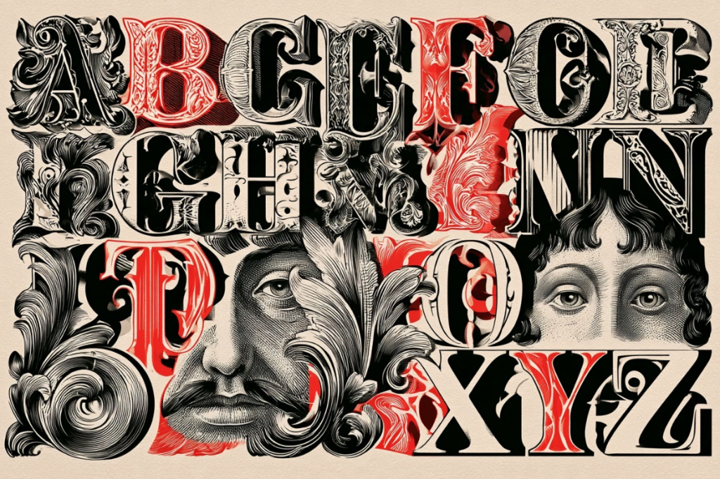
The best font selection for UI design balances personality with function. Avoid choosing a typeface simply because it looks distinctive in a presentation. Test it within real screens, navigation, forms, cards, and buttons.
How to Create a Strong Typography Hierarchy
A clear typography hierarchy tells users what to notice first, what to read next, and what information is secondary. Headings, subheadings, body text, labels, captions, and buttons should have clearly defined relationships.
For example, a product page could use a prominent heading, a smaller supporting statement, readable body copy, and a visually distinct CTA. This creates an intentional flow without relying on excessive colours or decorative elements.
A strong typography hierarchy is one of the most useful UI typography guidelines because it makes complex information easier to scan.
Typography Best Practices for UI Design
Useful typography best practices include:
- Keep body text comfortably readable.
- Use a limited number of typefaces.
- Establish consistent text styles.
- Maintain sufficient contrast.
- Avoid overly decorative fonts for functional content.
- Test typography on actual devices.
- Use spacing consistently.
- Consider accessibility from the beginning.
These typography best practices support the broader UI typography guidelines that keep interfaces consistent across screens.
Responsive Typography for Websites and Apps
Typography should adapt as the screen changes. A heading that feels balanced on desktop may dominate a mobile screen, while body text that works on a large display may become difficult to scan on a smaller device.
Responsive typography in user interface design can involve fluid type scales, responsive spacing, breakpoint-specific adjustments, and flexible containers. The goal is not simply to shrink text, but to preserve hierarchy and readability across contexts.
Good UI design typography therefore needs to be tested across screen sizes, orientations, and content lengths.
Common Typography Mistakes in UI Design
Common problems include using too many fonts, inconsistent font weights, insufficient contrast, tight line spacing, and unclear hierarchy. Another mistake is designing with placeholder copy and discovering later that real content breaks the layout.
Ignoring typography and readability can also create usability issues. Similarly, treating fonts in UI design as a purely aesthetic decision can lead to interfaces that look distinctive but become difficult to use.
Typography Examples in UI Design
Consider a banking dashboard. Account balances need immediate visual prominence, transaction details require a quieter treatment, and actions such as “Transfer” or “Pay” need clear labels.
A content platform may use larger headlines to establish editorial hierarchy, while an e-commerce interface may use typography to separate product names, prices, specifications, and purchase actions.
In both cases, typography design principles help users understand relationships between information. The goal is not to make every element stand out. It is to make the right elements stand out at the right time.
How to Build a Typography System for Your UI
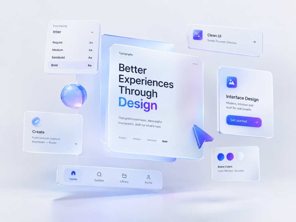
A scalable typography system should document typefaces, sizes, weights, line heights, spacing, and usage rules. Define styles for headings, body text, captions, labels, buttons, and other recurring components.
This becomes especially valuable when multiple designers and developers work on the same product. Leo9 Studio’s approach to design systems emphasises reusable components and shared rules that support consistency and collaboration.
A documented system also makes font pairing in UI design easier to manage. If two typefaces are used, define where each belongs rather than allowing arbitrary combinations.
Conclusion: Creating Better Interfaces With Typography
Effective typography in UI design is not about finding the trendiest font. It is about making information easier to understand while expressing the character of a product.
Strong UI typography, thoughtful font selection for UI design, clear hierarchy, and consistent typography best practices can reduce friction and strengthen the overall experience. When typography is considered alongside user behaviour, content, interaction, and visual systems, it becomes a strategic part of product design, not merely a finishing layer.
FAQs About Typography in UI Design
Typography in UI design is the practice of designing and arranging text within digital interfaces. It covers fonts, sizing, spacing, hierarchy, alignment, weight, and readability.
Good UI typography is readable, consistent, accessible, and aligned with the product’s visual language. It should help users understand information without creating unnecessary cognitive effort.
Font selection for UI design should consider readability, brand personality, available weights, language support, accessibility, and performance. Always test fonts in UI design using realistic content and screens.
There is no universal font size for every interface. The right size depends on the device, typeface, viewing distance, content, and accessibility requirements. Test actual UI typography rather than relying on a single number.
Typography affects how quickly users can scan and understand information. Strong typography and readability support smoother navigation, while poor hierarchy or spacing can make interfaces harder to use.
Accessible typography uses sufficient contrast, readable sizing, appropriate spacing, and clear hierarchy. These principles should be incorporated into UI typography guidelines rather than added after the interface is designed.
Most interfaces can work effectively with one typeface and multiple weights or styles. If multiple typefaces are introduced, font pairing in UI design should have a clear purpose and maintain visual consistency.