


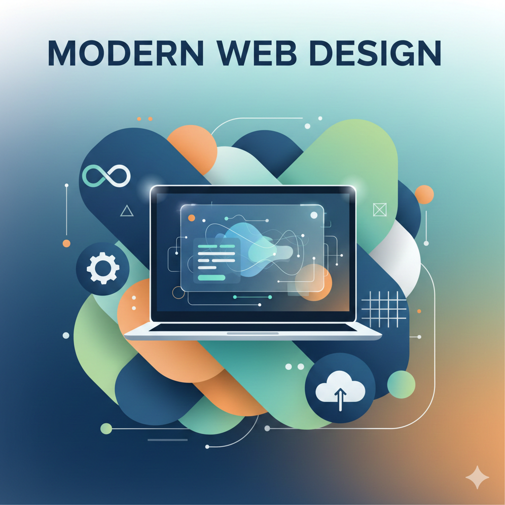
Trends Shaping Modern Web Design Today
Minimalism is more than just a visual style; it’s a philosophy that emphasises simplicity and functionality. By stripping away the unnecessary, a minimalist design creates clean, efficient, and user-friendly interfaces. This approach enhances user experience by ensuring that the focus remains on essential elements, facilitating easier navigation and faster load times.
Minimalism in web design has roots in the broader minimalist art movement of the 20th century. This movement sought to strip away excess and focus on essential elements, a principle that translates effectively into digital design. In the digital realm, this means prioritising content and function over decorative elements. As digital interfaces become more cluttered, the minimalist approach offers a refreshing alternative that emphasises clarity and focus.
- Improved User Experience: Simplified navigation and faster load times result in a more satisfying user experience. Users are less likely to become frustrated by complex interfaces, resulting in higher engagement and conversion rates.
- Focus on Content: With less clutter, users can focus on the content that matters. This can be especially beneficial for content-driven websites, such as blogs and news sites, where readability and user engagement are paramount.
- Timeless Appeal: Minimalist design often has a timeless quality, reducing the need for frequent redesigns. This not only saves resources but also ensures that your website remains relevant and aesthetically pleasing as trends evolve.
To successfully implement minimalist design, it’s crucial to start with a clear understanding of your brand’s core message and the needs of your users. Focus on essential elements, using whitespace strategically to create a sense of openness and clarity. Typography and colour schemes should be chosen with care to ensure that they complement the minimalist aesthetic without detracting from the user experience. By prioritising content and functionality, you can create a design that is both visually appealing and highly functional.
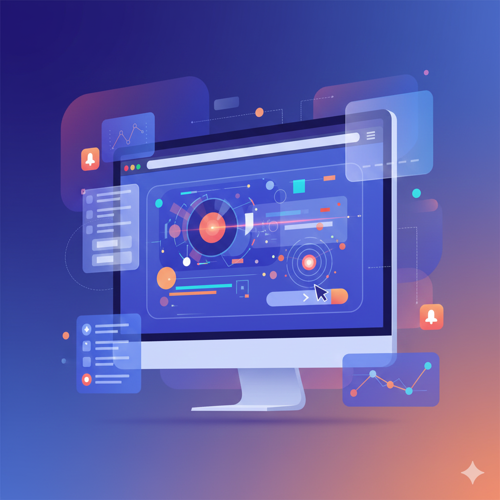
Animations and interactive elements have become crucial in creating engaging user experiences. When used thoughtfully, these elements can guide users through a website, highlight important information, and make the digital experience more dynamic and memorable.
Animations can significantly enhance user engagement by providing visual feedback and making interactions more intuitive. For instance, a subtle animation can indicate that a button is clickable, encouraging users to interact with the site. By incorporating animations that guide users through a seamless flow, you can reduce friction and improve the overall user experience.
- Micro-interactions: These subtle animations provide feedback to users and enhance interaction. For example, a like button that animates upon being clicked can create a more rewarding user experience.
- Loading Animations: Keep users engaged while content loads, reducing bounce rates. A creative loading animation can capture user attention and make the waiting period seem shorter.
- Parallax Scrolling: Adds depth to a website, making navigation more engaging. This technique creates a sense of movement and can be used to tell a story as the user scrolls through the page.
While animations and interactions can enhance user experience, it’s essential to strike a balance between creativity and functionality. Overuse of animations can lead to longer load times and may distract from the main content. Therefore, it’s crucial to ensure that animations serve a purpose and complement the user journey. Testing and user feedback can help refine these elements to enhance usability without compromising performance.
As more businesses recognise the importance of inclusivity, designing accessible websites has become paramount. Accessibility ensures that websites are usable by everyone, including people with disabilities. This not only broadens your audience but also enhances your brand’s reputation.
Web accessibility is guided by standards such as the Web Content Accessibility Guidelines (WCAG), which provide a framework for creating inclusive digital experiences. These guidelines cover various aspects of design, from contrast and text size to navigation and multimedia content. By adhering to these standards, you can ensure that your website is accessible to a diverse range of users.
- Contrast and Colour: Ensure text is legible against background colours. This involves choosing colour combinations that provide sufficient contrast to be readable by individuals with visual impairments.
- Keyboard Navigation: Websites should be navigable without a mouse. This is crucial for users with motor disabilities who rely on keyboard shortcuts to navigate through content.
- Alt Text for Images: Descriptive text for images helps screen readers convey content to visually impaired users. Providing detailed alt text ensures that all users can access and understand the visual content on your site.
Investing in accessibility not only promotes inclusivity but also offers tangible business benefits. By reaching a broader audience, you can increase your market share and customer loyalty. Additionally, accessible websites often perform better in search engine rankings, as search engines prioritise sites that offer a positive user experience. Emphasising accessibility in your design strategy can therefore lead to increased visibility and engagement.
Dark mode is a trend that has gained significant traction in recent years. It reduces eye strain for users in low-light environments and can save battery life on OLED screens. More brands are adopting dark mode to provide users with options that enhance comfort and personalisation.
Dark mode works by inverting the colour scheme of a website or app, using dark backgrounds with light text. This reduces the amount of light emitted by screens, which can be easier on the eyes, especially in low-light conditions. Studies have shown that dark mode can improve readability and reduce eye fatigue, making it a popular choice for users who spend extended periods on digital devices.
- User Comfort: Reduces eye strain, especially in dim settings. By providing an alternative to the traditional light mode, users can choose the option that best suits their needs and preferences.
- Battery Efficiency: Saves power on devices with OLED screens. Dark mode can prolong battery life by using less power to display dark pixels, making it a practical choice for mobile users.
- Aesthetic Appeal: Offers a sleek and modern look that many users find appealing. The high contrast of dark mode can highlight visual elements, creating a striking and visually engaging experience.
To implement dark mode effectively, it’s essential to consider both design and functionality. Ensure that colour contrasts are optimised for readability, and test the dark mode version of your site across different devices and browsers. Providing users with the option to switch between light and dark modes can enhance personalisation and user satisfaction. By offering a seamless transition between modes, you can create a more inclusive and user-friendly experience.
Personalisation has become a key strategy in web design, allowing brands to cater to individual user preferences and behaviours. By leveraging data, websites can offer tailored content, recommendations, and interfaces that resonate with users on a personal level. Personalisation taps into the human desire for recognition and relevance. By delivering content that aligns with individual preferences and behaviours, brands can create a sense of connection and loyalty. This psychological impact can lead to increased engagement and conversion rates, as users are more likely to interact with content that feels personally relevant.
- Dynamic Content: Changes based on user behaviour and preferences. This can include personalised greetings, location-based content, and customised product recommendations.
- Customizable Interfaces: Allows users to modify layouts and themes according to their liking. By offering users control over their experience, you can enhance satisfaction and retention.
- Targeted Recommendations: Uses browsing history and preferences to suggest relevant content or products. Personalised recommendations can drive sales and increase user engagement by presenting options that align with individual interests.
While personalisation offers significant benefits, it’s crucial to balance it with user privacy. Be transparent about data collection practices and provide users with control over their personal information. Implementing robust data protection measures can build trust and ensure that personalisation efforts are both effective and ethical. By prioritising user privacy, you can create personalised experiences that respect individual boundaries and foster long-term relationships.
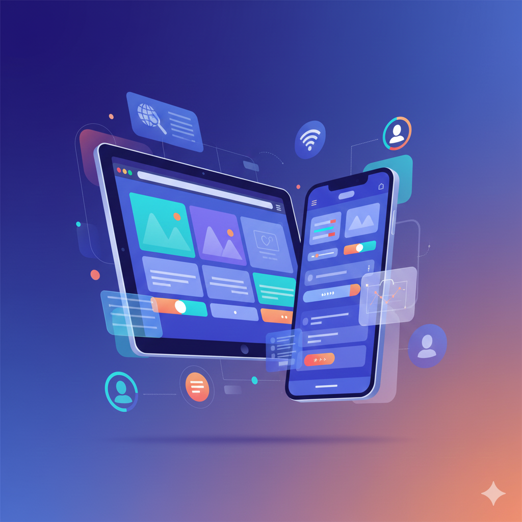
With the majority of web traffic coming from mobile devices, responsive and mobile-first design is no longer optional, it’s essential. A mobile-first approach ensures that websites are designed to work seamlessly on smaller screens before scaling up to larger displays.
The rise of mobile device usage has transformed how designers approach web design. Mobile-first design prioritises the mobile user experience, ensuring that content is accessible and functional on smaller screens. This approach considers the constraints of mobile devices, such as smaller screen sizes and touch navigation, to create a seamless experience across all platforms.
- Wider Reach: Caters to users who primarily access the web via mobile devices. By prioritising mobile accessibility, you can reach a larger audience and increase user engagement.
- Improved SEO: Google favours mobile-friendly sites in search rankings. A mobile-first approach can enhance your site’s visibility and attract more organic traffic.
- Better User Engagement: Ensures a consistent experience across all devices. By providing a seamless transition between devices, you can maintain user interest and reduce bounce rates.
To effectively implement a mobile-first design strategy, start by focusing on essential content and functionality. Use responsive design techniques to ensure that your site adapts to different screen sizes and orientations. Optimise images and media for faster load times, and test your design across various devices to ensure compatibility. By prioritising the mobile user experience, you can create a website that is both functional and engaging, regardless of how users access it.
Artificial intelligence and machine learning are revolutionising web design by offering smarter, more intuitive user experiences. These technologies can analyse user behaviour to improve site functionality and personalise content.
AI technologies can process vast amounts of data to identify patterns and trends in user behaviour. This information can be used to optimise website performance, enhance user experiences, and drive personalisation efforts. By leveraging AI, designers can create more responsive and adaptive digital environments that cater to individual user needs.
- Chatbots: Provide instant customer service and support. AI-powered chatbots can handle routine inquiries, freeing up human resources for more complex tasks.
- Predictive Analysis: Anticipates user needs and behaviours for more relevant interactions. By analysing past behaviour, AI can deliver personalised content and recommendations that align with user interests.
- Automated Design Elements: AI can adjust layouts and styles based on user preferences and data insights. This can streamline the design process and ensure that websites remain relevant and engaging.
As AI becomes more integrated into web design, it’s important to consider the ethical implications. Transparency in data collection and usage is crucial to building trust with users. Additionally, AI systems should be designed to respect user privacy and prevent biases that could impact user experiences. By prioritising ethical considerations, you can leverage AI to create innovative and user-friendly designs that align with your brand values.
As we integrate more technology into our designs, ethical considerations become increasingly important. Ethical design focuses on creating products that respect user privacy, promote transparency, and prioritise the user’s well-being.
- Privacy and Security: Protect user data and be transparent about its use. Implement robust security measures and communicate clearly about data collection and usage policies.
- Transparency: Clearly communicate how data is collected and used. Providing users with clear and accessible information builds trust and encourages informed decision-making.
- User Well-being: Design with the user’s mental and physical health in mind. Consider the impact of design elements on user behaviour and avoid practices that could lead to negative outcomes, such as addiction or stress.
Ethical design practices can enhance brand reputation and foster trust with users. Prioritising user privacy and well-being, you can create a positive brand image and build long-term relationships with your audience. Additionally, ethical design can differentiate your brand in a competitive market, attracting users who value transparency and responsibility.
To implement ethical design practices, start by conducting thorough research into user needs and preferences. Engage with stakeholders to understand potential ethical concerns and develop strategies to address them. Regularly review and update your design practices to ensure they align with evolving ethical standards. By taking a proactive approach to ethical design, you can create digital experiences that are both innovative and responsible.
Modern web design is about more than just aesthetics; it’s about creating functional, accessible, and engaging experiences that meet the diverse needs of users. By staying ahead of trends and integrating them thoughtfully, businesses can create websites that not only attract users but also foster loyalty and drive growth.
As you consider your next web design project, remember that a strategic approach, informed by the latest trends and guided by expert insights, can transform your digital presence into a powerful tool for success. At Leo9 Studio, we’re here to help you navigate this dynamic landscape with innovative solutions that exceed expectations. Let’s shape the future of your brand together.
Ready to elevate your website?
Connect with Leo9 Studio and turn modern design trends into real business results. Whether you’re building from the ground up or reinventing your online presence, our team is here to craft a digital experience your users will remember and return to.
FAQS
1. What type of website will I get custom design or a template?
You’ll want to know if the site will be built from scratch (custom) or use a pre-made template. Custom design gives you a unique look and tailored functionality. Template-based sites are faster and usually cheaper, but may feel more generic.
2. Will the website be mobile-friendly / responsive on all devices?
Since users come from phones, tablets, and desktops, your site needs to adapt smoothly. Responsive design ensures that layout, images, and navigation adjust to different screen sizes.
3. What’s the typical timeline and cost for building a website?
How long it takes depends on complexity: simple sites may finish in a few weeks, full-featured or e-commerce sites take longer. Cost also depends on the number of pages, features, need for custom design vs template, platform and maintenance.
4. Will I be able to manage and update the website myself later?
Good modern web design often involves a Content Management System (CMS) or a setup that lets clients add/edit content without needing to code. This matters if you plan to expand content or update details frequently.