


Understanding what elevates a website’s UX to an exceptional level is foundational before we explore our curated list. Exceptional UX design prioritizes user satisfaction by optimizing accessibility, usability, and enjoyment in the interaction between users and digital products. Several key elements contribute to this elevated user experience:
Intuitive navigation is the backbone of exceptional UX design. It ensures users can effortlessly explore a website without feeling lost or overwhelmed. Websites that prioritize intuitive navigation often employ clear and concise menu structures, logical page hierarchies, and easily recognizable icons. This intuitive layout allows users to find what they’re looking for quickly and efficiently, enhancing their overall experience.
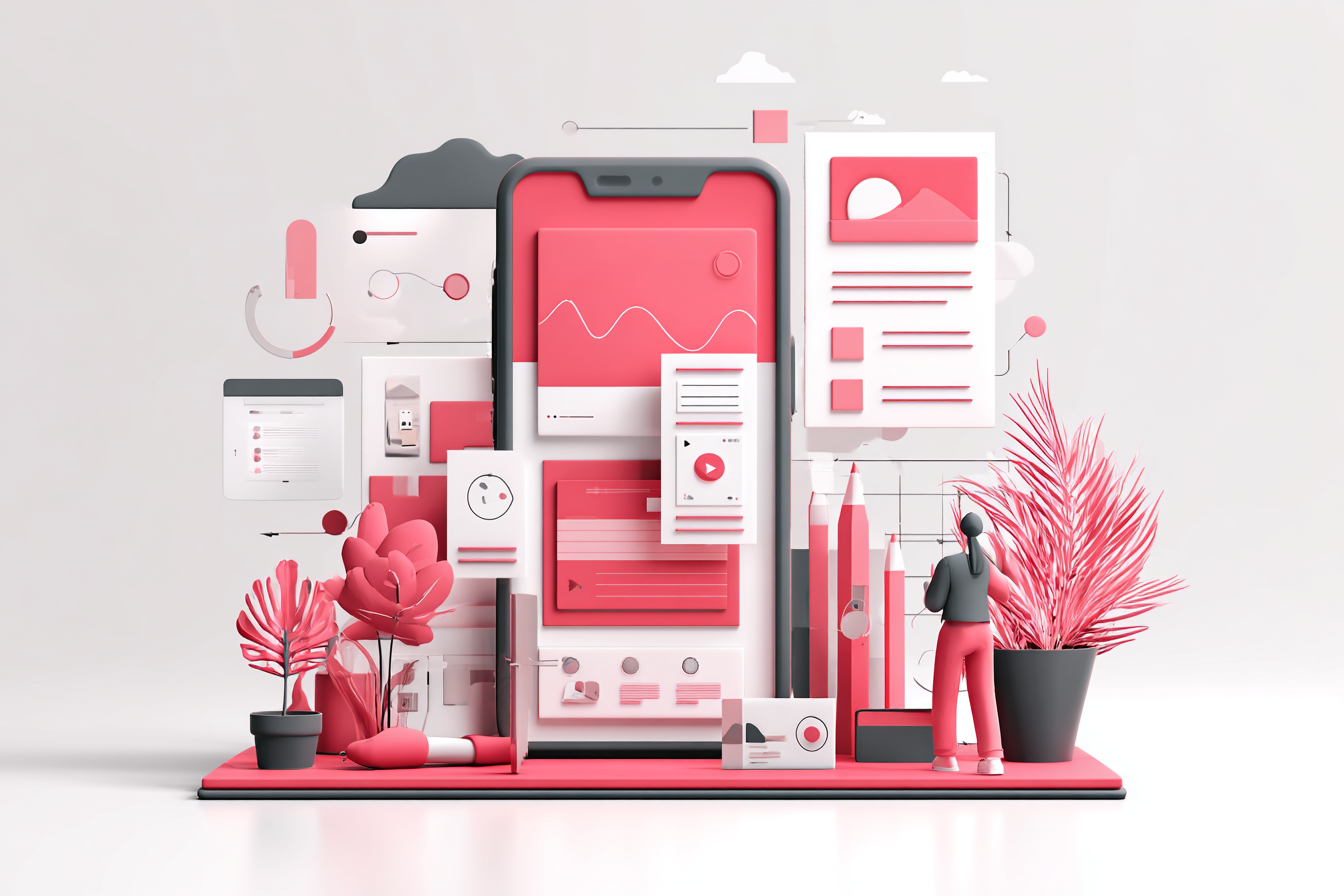
At Leo9 Design, we believe exceptional UX isn’t just about usability, it’s about emotional resonance and clarity. The following examples showcase the same principles we bring to every digital experience we design.
Responsive design is pivotal in today’s multi-device world. An exceptional website seamlessly adapts to different screen sizes and orientations, providing a consistent user experience across desktops, tablets, and smartphones. This adaptability not only enhances usability but also ensures that users enjoy the website without frustration, irrespective of the device they use.
In a fast-paced digital environment, users expect websites to load swiftly. Fast loading times are a hallmark of exceptional UX, as they prevent user frustration and reduce bounce rates. Websites that excel in UX design prioritize performance optimization techniques, such as image compression and efficient coding, to deliver content promptly to users.
Aesthetically pleasing design elements play a crucial role in enhancing user experience. Exceptional websites blend visual appeal with functional design, creating an engaging environment that draws users in. Effective use of color schemes, typography, and imagery can significantly impact a user’s perception of a website, making it memorable and enjoyable.
1. AirBNB
Airbnb is celebrated for its user-centric design that simplifies the travel booking process. Its clean interface, coupled with powerful search functionalities, allows users to find accommodations with ease. Let’s explore how Airbnb achieves this exceptional user experience.
Intuitive Navigation
Airbnb’s website features an intuitive navigation system that guides users through the booking process effortlessly. The clear menu options and categorized listings ensure users can quickly find accommodations that match their preferences. This streamlined navigation contributes to a hassle-free booking experience.
Seamless Booking Process
The booking process on Airbnb is designed to be seamless, reducing friction for users. From searching for accommodations to confirming bookings, each step is straightforward and accompanied by helpful prompts. This smooth process is a testament to Airbnb’s commitment to user satisfaction.
High-Quality Imagery
Airbnb leverages high-quality imagery to enhance the user experience. Stunning visuals of properties allow potential guests to envision their stay, adding an emotional connection to the booking process. This use of imagery not only informs but also inspires users.
2. Apple
Apple’s website stands as a paragon of simplicity and elegance. Known for its minimalist design, Apple focuses on showcasing its products through large visuals and straightforward navigation. Here’s how Apple achieves an exceptional UX.
Minimalist Design
Apple’s minimalist design philosophy is evident throughout its website. By eliminating unnecessary clutter, Apple emphasizes its products, allowing users to focus on what truly matters. This simplicity enhances user engagement and reduces cognitive load.
Consistent Cross-Device Experience
Apple ensures a consistent user experience across all devices. Whether accessed on a desktop or mobile device, the website maintains its design integrity and functionality. This consistency fosters trust and reliability among users, enhancing their overall experience.
Focus on Product Visuals
Large, high-quality product visuals are a hallmark of Apple’s website. By prominently displaying its products, Apple captures users’ attention and highlights the features and benefits of each item. This visual focus aids in decision-making and enriches the user experience.
3. Eton Solutions
Designed in collaboration with Leo9 Design, the platform’s UX reflects clarity, trust, and professionalism; mirroring the brand’s commitment to precision in wealth management. Eton Solutions exemplifies efficiency and clarity in digital design. As a global wealth management technology platform, its website delivers a professional and intuitive user experience that reflects precision and trust, key values in its industry.
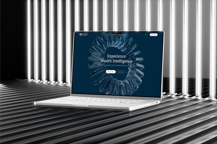
Clean and Structured Interface
Eton Solutions’ website maintains a clean, professional layout that communicates credibility. The structured hierarchy ensures visitors can access information about their products and services without friction.
Clear Communication and Flow
The copy and CTAs are crisp, ensuring users can immediately understand what Eton Solutions offers. Each interaction is purposefully designed to lead users toward meaningful engagement.
Emphasis on Trust and Functionality
For a financial platform, trust is everything, and Eton Solutions’ UX reinforces it through functional clarity, secure design cues, and seamless navigation that mirrors their product’s reliability.
4. Medium
Medium provides an unparalleled reading experience with its minimalist design and emphasis on content. The platform’s typography and layout are optimized for readability, immersing users in articles without distractions. Here’s how Medium achieves this.
Minimalist and Distraction-Free Design
Medium’s minimalist design creates a distraction-free environment for readers. By eliminating unnecessary elements, Medium allows users to focus solely on the content. This approach enhances user engagement and promotes a deeper connection with the material.
Optimized Typography for Readability
Typography is a critical component of Medium’s design, optimized for readability. The choice of fonts, sizes, and spacing ensures that text is easy to read, even during prolonged sessions. This attention to detail enhances the reading experience and reduces eye strain.
Focus on Content
Content is at the heart of Medium’s UX design. The platform prioritizes articles and stories, encouraging users to explore and discover new material. This focus on content fosters a community of engaged readers and writers, enriching the overall experience.
5. Spotify
Spotify’s website offers an engaging and intuitive experience for music enthusiasts. With a visually appealing interface and seamless navigation, users can effortlessly discover and enjoy music. Let’s explore how Spotify enhances user engagement.
Visually Appealing Interface
Spotify’s visually appealing interface captivates users from the moment they land on the site. Vibrant colors and dynamic visuals create an inviting atmosphere, encouraging exploration. This aesthetic appeal is integral to Spotify’s engaging user experience.
Seamless Navigation
Seamless navigation is a cornerstone of Spotify’s UX design. Users can easily browse through music genres, playlists, and recommendations without encountering obstacles. This fluid navigation enhances user satisfaction and encourages prolonged engagement.
Personalized Playlists and Recommendations
Spotify excels in personalization, offering tailored playlists and music recommendations. By analyzing user preferences and listening habits, Spotify delivers a customized experience that resonates with individual tastes. This personalization deepens user connection and loyalty.
6. Amazon
Amazon exemplifies a UX design that balances complexity and usability. Despite its vast product range, Amazon’s website remains organized and user-friendly. Here’s how Amazon streamlines the shopping experience.
Organized Layout for Vast Product Range
Amazon’s organized layout effectively manages its extensive product catalog. By categorizing products and using intuitive filters, Amazon ensures users can quickly locate items of interest. This organization is crucial in navigating the platform’s vast offerings.
Personalized Recommendations
Personalized recommendations are a key feature of Amazon’s UX design. By analyzing user behavior and preferences, Amazon suggests relevant products, enhancing the shopping experience. This personalization not only boosts sales but also fosters user satisfaction.
One-Click Purchasing
One-click purchasing simplifies the buying process on Amazon. This feature allows users to make purchases with minimal effort, streamlining the checkout experience. By reducing friction, Amazon enhances user convenience and encourages repeat visits.
7. Slack
Slack’s website is a testament to effective UX design through simplicity and functionality. The platform’s design facilitates communication and collaboration, supporting productivity. Let’s delve into the elements that make Slack’s UX outstanding.
Simple and Functional Design
Slack’s simple and functional design focuses on usability. The intuitive interface allows users to navigate the platform effortlessly, supporting seamless communication and collaboration. This simplicity enhances user satisfaction and efficiency.
Easy-to-Use Interface
An easy-to-use interface is central to Slack’s UX design. By prioritizing user-friendly features and intuitive controls, Slack ensures users can access tools and functionalities without confusion. This ease of use enhances productivity and user engagement.
Focus on Communication and Collaboration
Communication and collaboration are at the heart of Slack’s UX design. The platform provides tools that facilitate interaction and teamwork, supporting diverse workflows. This focus on communication enriches the user experience and promotes effective collaboration.
8. KPIT Technologies
KPIT’s innovation-first experience reflects the design philosophy Leo9 Design applies when shaping complex, tech-driven ecosystems. KPIT Technologies stands out with a UX that mirrors its innovation-led DNA. As a global leader in automotive software and mobility solutions, its website combines futuristic design with user-first usability.

Visually Engaging Yet Professional Design
KPIT’s website embraces a modern, tech-forward aesthetic, balancing vibrant visuals with a structured interface that communicates expertise and innovation.
Dynamic Navigation for Complex Offerings
With diverse solutions across electrification, autonomous systems, and software platforms, KPIT employs dynamic yet intuitive navigation to simplify discovery and comprehension.
Showcasing Innovation Through Interaction
Interactive animations and motion elements highlight KPIT’s technological focus, allowing users to explore services in a way that feels both educational and immersive.
9. Etsy
Etsy’s website effectively combines aesthetics and functionality to create a unique shopping experience. The platform showcases products with large images and detailed descriptions. Let’s explore how Etsy enhances the shopping journey.
Aesthetic and Functional Design
Etsy’s design balances aesthetics with functionality, creating an inviting shopping environment. The use of visual elements and intuitive navigation supports an enjoyable and efficient shopping experience. This balance enhances user engagement and satisfaction.
Large Product Images
Large product images are a hallmark of Etsy’s UX design. By providing detailed visuals, Etsy allows users to closely examine items before purchasing. This transparency builds trust and confidence among buyers, enhancing the overall experience.
Detailed Product Descriptions
Detailed product descriptions complement Etsy’s visual elements, providing essential information about items. This comprehensive approach ensures users have all the information needed to make informed purchasing decisions. This detail enhances the shopping journey and user satisfaction.
10. Behance
Behance is a go-to platform for design inspiration, offering an exceptional UX that highlights creative works. The website’s design is clean and focuses on showcasing user portfolios. Here’s how Behance supports discovery and creativity.
Clean Design Focused on Creative Works
Behance’s clean design emphasizes creative works, allowing users to explore portfolios without distractions. This focus on content supports the discovery of new projects and ideas, enriching the user experience.
Easy Navigation and Discovery of Projects
Easy navigation is crucial to Behance’s UX design. Users can effortlessly browse through projects and portfolios, discovering new content with ease. This straightforward navigation supports creative exploration and inspiration.
Showcase of User Portfolios
The showcase of user portfolios is central to Behance’s UX design. By providing a platform for creatives to display their work, Behance fosters a vibrant community of designers and artists. This emphasis on creativity enhances the user experience and supports artistic growth.
Conclusion about Best UX Websites
Exceptional UX design is about crafting an experience that is seamless, intuitive, and enjoyable for users. The websites highlighted in this article exemplify the pinnacle of great UX design, offering inspiration for anyone seeking to elevate their digital presence. Whether you’re designing an e-commerce site or a creative portfolio, these examples provide valuable insights into creating user-centric platforms that resonate with your audience.
Remember, the best UX design anticipates and understands user needs, providing a smooth and satisfying journey from start to finish. By integrating these principles into your design process, you can enhance your website’s UX and achieve greater success in engaging and retaining users. For the best results reach out to us!
FAQs on Best UX Websites
1. What makes a website’s UX design exceptional?
Exceptional UX design focuses on how users feel while interacting with a product. It’s not just about visuals, it’s about clarity, navigation, speed, accessibility, and emotional connection. Great UX anticipates what users need and simplifies their journey at every step.
At Leo9 Design, we apply this principle by blending behavioral psychology, design systems, and storytelling to craft experiences that truly connect with audiences.
2. Which websites have the best UX design examples?
Some of the best UX websites include Apple, Airbnb, Eton Solutions, KPIT Technologies, Spotify, and Amazon, each known for simplifying complex interactions into seamless experiences.
If you’re inspired by these brands and want to elevate your own platform, explore Leo9 Design’s UX/UI services to create similar world-class experiences.
3. Why is UX design important for business growth?
A strong UX directly impacts your brand perception, conversion rates, and customer loyalty. When users find your product easy and enjoyable to use, they’re more likely to stay, engage, and buy.
Businesses partner with Leo9 Design to translate complex digital challenges into intuitive, revenue-driving experiences.
4. How can small or mid-size companies improve their UX design?
You don’t need a massive design team to build great UX. Start by understanding user pain points, simplifying navigation, improving loading speeds, and testing designs frequently. Partnering with an experienced design studio helps you implement these insights faster and smarter.
Leo9 Design’s UX process is tailored for startups and enterprises alike, helping them craft intuitive products that scale beautifully.
5. What’s the difference between UI and UX design?
UI (User Interface) focuses on the look and feel – buttons, typography, layout, and color.
UX (User Experience) focuses on the flow and functionality – how users move through and interact with your product. Both work hand-in-hand to create seamless digital experiences.
At Leo9 Design, our UI/UX design approach ensures your product isn’t just beautiful, it’s meaningful, intuitive, and results-driven.
6. How do I get started with improving my website’s UX?
Begin with a UX audit, analyzing user behavior, data, and friction points. From there, redesign your navigation, simplify your layout, and test your interactions with real users.
You can start by booking a UX consultation with Leo9 Design to identify what’s working, what’s not, and how to turn your site into a user delight engine.