Today we are going to show you in this article some of the most important design mistakes that are responsible for mobile app design failure.
There are about 300,000 apps being added to Google play store alone in 2019. According to Garner, only about 0.01% of all consumer mobile apps are financially successful throughout 2018.
So the odds of success are 1 in 10,000, so low? have you been wondering why most of them have been failing?
We are an app development company, and hence we understand this, we are going to specifically look at user interface (UI) and user experience (UX) design mistakes in this article.
1. Are you making your user think too much?
Heavy cognitive load: If your app has too much information or the information is not well arranged, the user tends to become overwhelmed and abandon the app.
Consider organizing your information in simple ways that user can understand with minimal cognitive load.
1. Progressive disclosure: We only want to see what we need right now to accomplish what we are trying to do. Information presented to someone who isn’t interested or isn’t ready to process is a noise.

2. Minimize user input & anticipate user’s needs at every step of the journey.
Example – drop-down menu instead of asking the user to type out the reason.
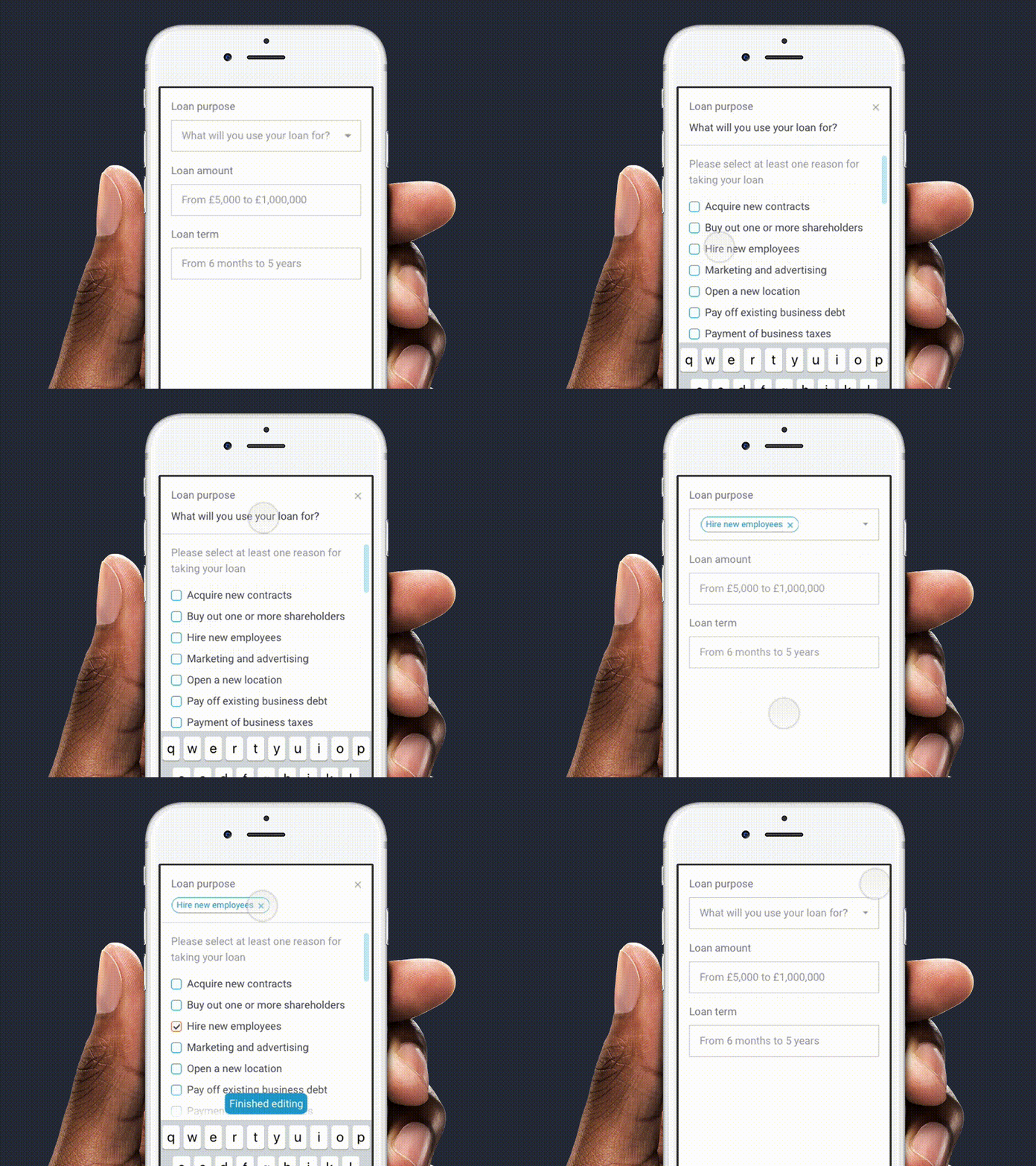
3. Break tasks into bit sized chunks
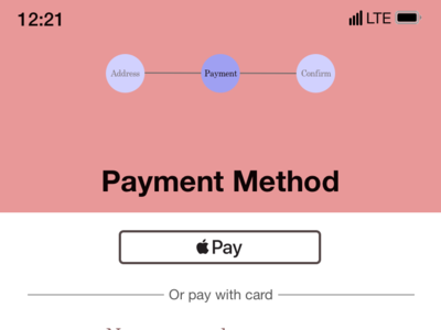
2. Do you have a lengthy on-boarding process or sign-in walls?
One of the things that drive users away when they open your app is the request of personal information. Users are usually skeptical about dropping personal information to a site they do not trust.

Think of providing an option to skip login & allow the user to experience your app before you ask for anything. Let them go through the app, understand the value proposition & then you can ask for their information or login details when required.
3. Are you asking for user permission soon after the login or launch of the app?
User research shows that when users launch an app, they expect it to just work & do not want to see any notifications or permissions. If the first thing user sees when launching the app is a dialog requesting for permissions then they are more likely to abandon the task & move on to a better app.
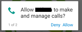
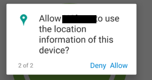
Solution: Users are more likely to grant permission if asked during a relevant task.
1. Ask for user permission in context.
2. Ask permission only if it is needed during the task
3. Explain clearly why the app needs the information, if it’s not obvious Sometimes.
4. Is the navigation intuitive?
Your app should have very simple navigation options, this would make it easier for people to find all the component that you include within the app.
Imagine you are blindfolded, and thrown in the trunk of a car & driven around the city for an hour . Then you are dumped out in some random part of the city . b
Based on what you see around you , can you answer these 4 questions?
a) Where am I?
b) How did I get here?
c) What can I do here?
d) Where can I go from here?
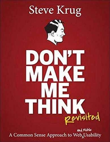
“Don’t make me think” by Steve Krug introduces Trunk test for Navigation.
If you can answer all of the above for every screen of your app, then you pass trunk test
5. Is your value proposition clear?
Almost everyone who downloads an app wants it to solve a particular need that they have. A value proposition is a clear statement that shows a customer exactly how your product or services can solve their problem.
Communication of clear value proposition to the user is of utmost importance. Make sure users recognize why they need your app in the first place.
What value does your app provide — Make their lives easier or better?
6. Slow loading?
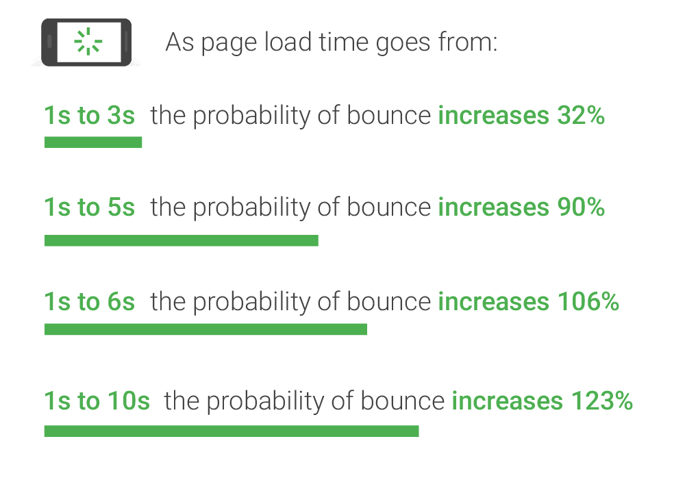
The average loading time usually 2 seconds, anything higher than this can lead them to abandon the app.
Now you know the importance of load time…
- keep server response times in check by Minimizing http requests and re-directs
2. Use clever animation or micro-interactions to retain user’s attention while they wait.
3. load just enough content that gets seen first and foremost when a page opens.
So why continue to design apps that users delete at first glance, just follow these steps and you are well on your way to creating a terrific app. Read our Stop These 5 Common Mistakes Right Now! to figure out certain common mistakes designers do.
Want us to create a great mobile app design your business?
Say hello to us at info@leo9studio.com

About us: Leo9 Studio is a Premier Design & Tech Agency. We help Enterprises and Startups alike build Great Products, Gorgeous Interfaces, Great Brands.


